A Connecticut basement can look like the obvious place for a dark, cinematic man cave, until the low ceiling and small windows make charcoal walls feel almost black. In an older home, the room may also have exposed pipes, painted paneling, or a drop ceiling to work around. Along the coast, daylight can shift the way a paint color reads, while long winter evenings put more weight on artificial lighting.
The right man cave colors do more than set a mood. They help a room work for sports nights, movies, poker, reading, or a workbench, while making existing flooring, furniture, and memorabilia feel like they belong. Dark shades can create an intimate viewing space, but a well-chosen greige or green can be more comfortable in a multipurpose basement.
There's no universal palette for a man cave. The idea grew from personal-use rooms shaped by hobbies, media, and collecting, rather than a single fixed style, as the history of the man cave explains. These eight palettes balance atmosphere with practical choices about finish, lighting, trim, and the kinds of rooms common across Connecticut.
1. Moody Charcoal and Black Monochrome
For a dedicated theater or media lounge, charcoal and black can make the screen and artwork the focus. Layering graphite walls with a near-black door or trim gives the room depth without relying on several competing colors. In an older Connecticut basement with a low ceiling, this can make exposed beams or an existing drop ceiling feel like part of a deliberate design.
The trade-off is that dark paint absorbs more light and can make a compact room feel smaller. Architectural guidance describes light-reflectance value, or LRV, as a measure of reflected visible light, and notes that dark colors can increase the need for artificial illumination. For a media room, that can be useful on the screen wall, but less so if the room also needs to support cleaning, serving food, or board games.
Give dark paint enough light to work
Try a mid-gray-tinted primer under a deep charcoal, then use matte or eggshell on the walls to limit distracting reflections. A lighter ceiling can preserve a sense of height, especially in a basement where the ceiling already feels close. Plan layered lighting rather than relying on a single overhead fixture: ambient light for the room, task light for seating or a bar, and accent light for shelves or memorabilia.
Before committing, put large samples on two walls and look at them in daylight and evening conditions. The same paint can read differently across a wall than it does on a small sample, so a chip alone isn't a reliable preview. For lighting that needs to show color accurately, the cited specification guidance identifies CRI 90 or above as excellent color rendering and approximately 3000 K as a warm, natural-light-like appearance. The visible-light and paint-specification guidance can help designers and builders think through those choices.
Practical rule: Use near-black where you want visual focus, not automatically on every surface.
2. Navy Blue with Brass and Gold Accents
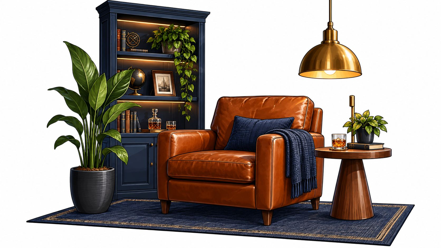
Navy feels polished rather than rugged when it's paired with warm wood, brass hardware, and leather seating. It suits a Fairfield County library-style den or a Stamford basement lounge where the owner wants a club-room mood without turning the space into a sports bar. A deep blue wall behind a bookcase or bar can also frame objects that already have meaning, from framed jerseys to travel finds.
Keep the metallic finish consistent. Brass on the bar hardware, lamp, and cabinet pulls looks intentional; mixing several gold-toned finishes can make a compact room feel busy. Cream or warm-white trim creates a clean border and keeps the blue from pressing in, while eggshell or satin gives the walls a richer look without the glare of a high-gloss finish.
Check the blue under the room's bulbs
A navy that looks warm in daylight can turn gray under cool-toned LEDs. Test a large sample beside the flooring and upholstery, then inspect it with the actual lamps and ceiling fixtures switched on. If the room is used for movies as well as conversation, dimmable warm lighting can preserve the lounge atmosphere without leaving the bar or shelves too dark to use.
A reading nook with a brown leather chair and dark blue shelving shows how this palette can feel comfortable rather than formal. The navy-and-leather reading nook offers a useful visual reference. Navy also has a place in the broader history of branded sports rooms: team-color furnishings helped turn the private retreat into a more coordinated design concept, as described in this history of man-cave design.
3. Hunter Green with Leather and Natural Wood
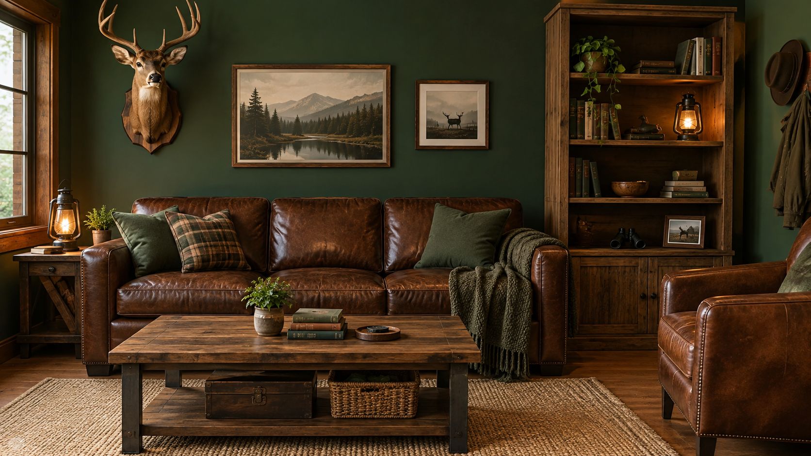
A muted hunter or forest green works well when the room already has warm timber, leather seating, or lodge-inspired details. In a Litchfield County or Tolland County home with barn-style beams, a green game-room wall can connect the furniture and architectural woodwork without making the room feel like a themed restaurant. The color also suits a den with fishing, hunting, or nautical memorabilia, provided the objects remain personal rather than crowded.
Look for green with a soft gray or brown undertone. A highly saturated green can compete with orange-toned wood, while an earthy version tends to sit more naturally beside walnut, oak, and brown leather. Bring actual wood and upholstery samples to the paint store or hold them beside a painted sample board at home. Color names alone won't tell you whether the undertones will cooperate.
Keep one surface lighter
Green can feel restful and established, but deep green on every wall may make a basement feel closed in. Pair it with a cream ceiling, pale rug, or light upholstery to give the eye a place to rest. If the room doubles as a games area, use brighter task lighting over the table and keep decorative lighting warmer around the seating.
A rustic living room with green walls, leather furniture, and wildlife-inspired decor illustrates the palette's traditional side. See the green-walled lodge-style room for a reference point. The aim isn't to copy every detail. Use the green as a background for the pieces you already own, and let the material mix carry the character.
4. Bourbon Brown and Cognac Warm Tones
Brown makes a basement feel welcoming when gray concrete, old paneling, or cool north-facing light leaves the room feeling stark. A bourbon-inspired wall color paired with cognac chairs, saddle-colored leather, and warm wood can create the ease of a private bar or vintage library. This approach works particularly well in a Stamford or Westchester retreat used for conversation and relaxing, not just screen viewing.
The risk is a muddy result. Brown paint can look flat if its undertone clashes with the floor or if the room has little daylight. Choose a sample with a clear red or yellow warmth, and compare it directly with the leather and wood before painting. If the room is narrow or has a low ceiling, limit the deeper brown to one or two walls rather than wrapping the whole room.
Let the materials provide variation
Cream or off-white trim gives the eye a lighter edge, while mixing cognac, tan, and saddle leather keeps the furniture from reading as one solid block. Amber-toned lamps can reinforce the cozy mood, but don't use them as the only light source if the room needs to support cards, a bar, or other close-up tasks. Add a neutral task light where people will read labels, handle game pieces, or prepare drinks.
This palette doesn't need whiskey signs or a full speakeasy theme to work. A brown accent wall, comfortable seating, and existing wood furniture can be enough to make a basement feel finished. Keep the decor restrained if the room also serves as a family lounge, and let the warmer paint support the room's daily use.
5. Team Colors and Bold Accent Wall
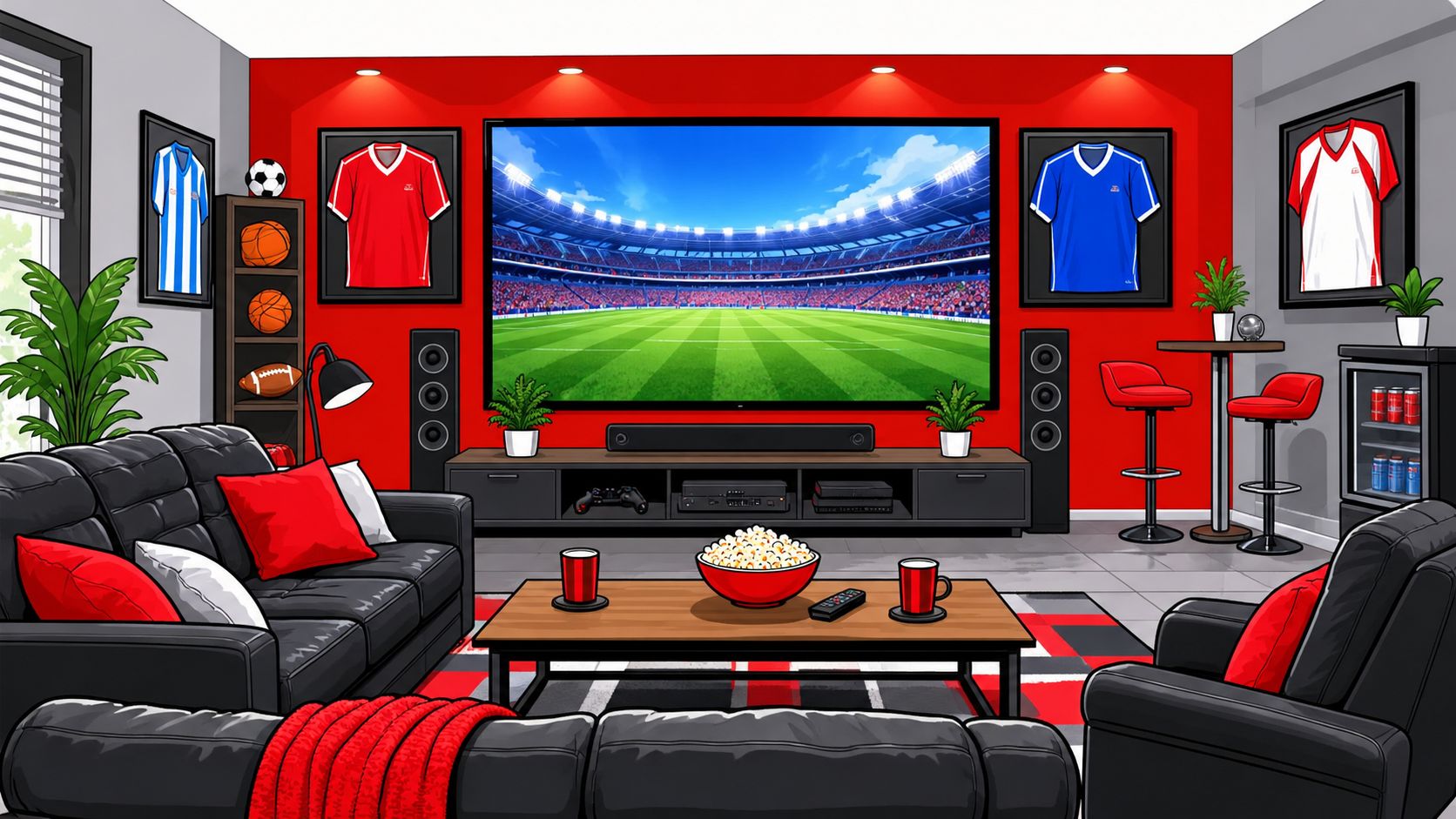
A team-color wall gives a sports-focused room a clear focal point without requiring every surface to match the logo. In a Fairfield County basement, use the wall behind the television or memorabilia display for the bold color, then keep the adjacent walls neutral. That lets jerseys, framed photos, and banners stand out instead of competing with a fully saturated room.
The approach reflects how man-cave design became more coordinated over time. Sports-themed furnishings in team colors helped establish the room as a deliberately branded space, and later television renovation shows reinforced the idea of a themed retreat. The practical lesson is to treat team colors as an identity system, not a reason to paint every wall in a strong shade. There's no reliable universal percentage for which man-cave color fans prefer, so let the homeowner's team and the room's architecture guide the choice.
Use the accent where it earns attention
Red, blue, or green can be forceful on a full wall. Before painting, test the shade under the room's evening lighting and decide whether it works with the surrounding neutral. Charcoal can temper a bright blue, while a softer gray can help a strong red feel less intense. Use satin or semi-gloss only if easier cleaning is a priority and the wall is smooth, since sheen can emphasize surface flaws.
A modern sports lounge with a red focal wall shows how the effect can stay concentrated around the screen and decor. See the sports-themed man cave example. For a practical finish, choose the sheen with the wall condition and cleaning needs in mind, not just the color.
6. Industrial Gray and Concrete with Black Steel
Gray walls, black metal, and concrete-look details suit a clean-lined Stamford condo or a modern basement den where traditional leather-and-brass styling would feel out of place. This palette can also work in a garage conversion, particularly when shelving, a workbench, or steel-framed furniture already gives the room an industrial edge. The key is choosing a gray that relates to the floor and the room's daylight rather than defaulting to the coldest available sample.
A warm gray softens the hard materials. Pair it with a wood shelf, leather chair, or textured rug so the room doesn't feel like a showroom or echo chamber. Bare concrete, glass, and metal can bounce sound around; rugs and fabric-covered acoustic panels help make conversation and television audio more comfortable.
Test for undertones before painting
Gray often shifts between daylight and artificial light. Place samples beside the concrete or tile, then check them after dark with the fixtures you plan to keep. A gray that reads balanced by day may turn blue under cool LEDs, while a warmer gray can look beige beside a cooler floor.
For a compact man cave, keep black steel to shelving, lighting, or furniture frames rather than outlining every surface. That contrast gives the palette structure without making the walls feel heavier. A short overview of industrial-style color and materials can help prompt ideas; view the industrial man-cave design video as a visual reference.
7. Light Greige and Bright Neutral Man Cave
A man cave doesn't have to be dark. Light greige, warm white, and pale taupe work well in a Connecticut basement that doubles as an office, reading room, or family game space. In a Litchfield County home with limited daylight, a lighter wall color can keep the room usable throughout the day, while charcoal or navy furniture provides enough contrast to make the scheme feel grounded.
Choose a greige with warmth if the room has cool concrete flooring or little natural light. A gray that leans too blue can feel chilly beside winter light and painted basement trim. EggshelI or satin can make walls easier to clean, though the wall should be prepared well because extra sheen can make dents and patching more visible.
Use contrast without making the room busy
Keep the ceiling lighter than the walls to help it feel more open, especially when the room has a low ceiling. A charcoal chair, dark rug, or navy bookcase can anchor the palette without relying on a large dark wall. If the room also serves as a workspace, aim task lighting at the desk rather than trying to brighten the entire space with one harsh overhead fixture.
Color drenching, where walls, trim, and often the ceiling share one hue, was identified as the leading interior color trend by 55% of the professionals in a 2025 Fixr survey of 67 interior-design professionals. The figure comes from the Fixr interior color trends report. A lighter, coordinated neutral can borrow that cohesive feel while avoiding the visual compression that a deep, all-over color may create in a small basement.
8. Oxblood Red and Black Bold Statement
Oxblood and burgundy bring a vintage-club mood to a bar nook, library corner, or lounge with black leather and aged brass. In a basement where one wall already anchors the seating or bar, deep red can make that area feel distinct from the rest of the home. It suits owners who want a dramatic finish and are comfortable making the room feel intentionally enclosed.
In a smaller room, start with an accent wall rather than painting all four. Deep reds can change noticeably under different bulbs, so test a generous sample in both warm and cool lighting before choosing a finish. Eggshell or satin gives the wall some durability without the strong shine that may distract from the furniture or art.
A dramatic color works best when the room has a clear focal point and the lighting lets you see the details around it.
Balance the red with quiet surfaces
Black furniture or trim can sharpen the look, but too much black alongside oxblood can make the space feel heavy. Use a lighter ceiling, warm wood, or a cream rug to interrupt the dark surfaces. If the room serves a bar or games function, include neutral-white task lighting for serving and cleanup, then reserve colored LEDs for accents.
The size trade-off matters: brighter side walls can make a room appear wider, while darker walls can make it feel more contained, as discussed in this study of perceived room dimensions. That doesn't rule out a dark red wall. It's a reason to place it deliberately, especially in a narrow basement where people need clear circulation around seating and tables.
8 Man Cave Color Schemes Compared
| Color Scheme | Implementation Complexity 🔄 | Resource Requirements ⚡ | Expected Outcome 📊 | Ideal Use Cases | Key Advantage ⭐💡 |
|---|---|---|---|---|---|
| Moody Charcoal and Black Monochrome | High: dark paint needs careful testing and coverage; plan layered lighting | Mid-gray primer, matte or eggshell paint, multiple warm and accent light sources | Cinematic, focused atmosphere with reduced screen glare | Home theaters, media rooms, finished basements | Dark walls hide minor flaws and make screens and artwork stand out |
| Navy Blue with Brass and Gold Accents | Moderate: coordinate navy, warm neutrals, and a consistent metal finish | Navy paint, brass or gold details, warm lighting, wood or leather furnishings | Polished, warm, club-like feel | Upscale lounges, bars, study-style retreats | Metallic accents add warmth and refinement |
| Hunter Green with Leather and Natural Wood | Moderate: balance dark green with lighter surfaces and natural materials | Green paint, wood, leather, warm lighting, optional natural-fiber textiles | Calm, grounded, lodge-inspired atmosphere | Game rooms, traditional libraries, lodge-style spaces | Green pairs naturally with durable wood and leather |
| Bourbon Brown and Cognac Warm Tones | Moderate: select compatible brown undertones and avoid overusing dark shades | Brown paint or accent wall, leather and wood furnishings, warm or amber lighting | Cozy, intimate, welcoming space | Entertaining rooms, whiskey lounges, basements | Warm materials develop character and suit casual hosting |
| Team Colors and Bold Accent Wall | Low to moderate: focus bold color on one wall and keep others neutral | Accent paint, washable finish, neutral paint, team décor | Energetic, personalized focal point | Sports rooms, game-day spaces, fan-focused bars | Easy to refresh without repainting the whole room |
| Industrial Gray and Concrete with Black Steel | Moderate: coordinate gray undertones and manage hard-surface acoustics | Gray paint or concrete-look finishes, black metal, rugs or acoustic panels | Clean, modern, understated look | Lofts, urban apartments, modern condos | Versatile palette with durable, low-maintenance materials |
| Light Greige and Bright Neutral Man Cave | Low: neutral palette is simple to coordinate; add accents for contrast | Light neutral paint, warm white trim, light furnishings, selected dark accents | Brighter, more spacious, adaptable room | Small rooms, home offices, multi-use spaces | Broadly compatible with changing furniture and décor |
| Oxblood Red and Black Bold Statement | High: strong color requires testing and may need extra coats | Deep red paint, black furnishings or trim, aged-metal accents, warm lighting | Dramatic, luxurious focal-point effect | Dramatic lounges, cigar rooms, statement spaces | Rich color pairs effectively with black, leather, and warm metals |
Choosing the Right Palette for Your Space, and Getting It Done Right
Start with the room, not the paint chip. A dedicated theater with controlled lighting can support charcoal or oxblood, while a basement that also serves as an office or playroom may work better in greige, warm white, or a muted green. A low ceiling and limited windows are reasons to consider a lighter ceiling and brighter task lighting, even if the walls stay dark.
Next, account for permanent features. Check the palette beside flooring, woodwork, cabinetry, stone, leather, and any large furniture that will remain. A navy that suits brass and warm wood may clash with cool gray flooring, while brown can make existing timber feel intentional. Decide where you want the strongest color to land, then use trim and adjacent walls to support that focal point.
Samples are essential. Paint large boards or wall sections and review them at different times of day, with the actual bulbs, lamps, and screens in use. Color changes with light and sheen, and a sample can look different once it covers an entire wall. If you're considering a very dark shade, test it on more than one wall and check whether the room still feels comfortable for its everyday tasks.
For designers, builders, and homeowners, paint selection is also a coordination decision. Match the finish to the surface and how people use it: low-sheen walls can help limit screen reflections, while a bar or workbench may need more direct light and a washable finish. The right balance depends on the room's condition and the people who'll use it, not a rule that every man cave must be dark.
CP Painting Company offers interior painting and color guidance for homeowners across Stamford, Fairfield County, Westchester, and surrounding Connecticut counties. Ask for a transparent estimate that reflects the room's preparation, surfaces, finishes, and intended use. A locally compliant project plan should account for applicable Connecticut Department of Consumer Protection and local-government requirements, alongside the practical work needed to prepare and paint the room.
If you're planning a man cave in Connecticut, CP Painting Company can help you choose colors and finishes that suit the room's light, layout, and furnishings. Visit CP Painting Company to discuss your project and request a free estimate.