
Choosing the right paint color for your bathroom is about more than just personal preference; it’s a strategic design choice that impacts the entire feel of the space. In a room defined by moisture, compact layouts, and specific lighting, the perfect hue can make it feel larger, cleaner, and more serene. Conversely, the wrong shade can make a bathroom feel dated, cramped, or dim. This is particularly true for homeowners and contractors across Fairfield County and Westchester County, where local architectural styles and design trends influence what works best.
This guide cuts straight to the point, exploring the eight most common bathroom paint colors that professional painters consistently see in high-end residential projects. We move beyond simple swatches to provide actionable advice for each color family. You will find specific recommendations on moisture-resistant paint finishes, ideal lighting pairings, and how to select complementary trim, tile, and vanity combinations. For those in the Stamford, CT area, we've also included notes on local style trends and practical considerations for a flawless application. Our goal is to give you the detailed insights needed to select a palette that is both beautiful and built to last, ensuring your bathroom project is a complete success.
1. Soft White & Cream
Soft whites and creams are consistently among the most common bathroom paint colors for a simple reason: they deliver a timeless, clean aesthetic that feels both fresh and calming. These shades are foundational in the Northeast, especially in Connecticut and New York, where they create a spa-like retreat that maximizes light. In smaller or windowless bathrooms, a soft white can make the space feel larger and more open by reflecting both natural and artificial light effectively.
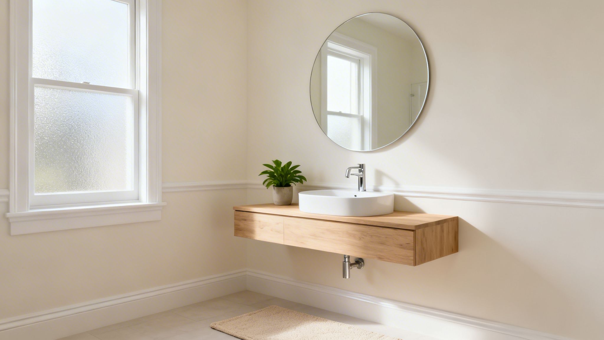
This color family serves as a versatile backdrop for almost any design style, from modern minimalist to classic traditional. It allows fixtures, tilework, and vanity choices to become the focal point. For a project to truly succeed, selecting the right undertone is critical.
Implementation and Popular Choices
The nuance in whites makes a significant difference. Consider these popular examples seen in local projects:
- Benjamin Moore 'Chantilly Lace' (OC-65): A crisp, clean white with minimal undertones, it’s a favorite for high-end residential projects in Stamford, CT, that aim for a bright, gallery-like feel.
- Sherwin-Williams 'Pure White' (SW 7005): With a touch of warmth, this white is popular in Fairfield County renovations because it avoids feeling sterile while remaining brilliantly bright.
- Behr 'Swiss Coffee' (12): This creamy off-white is a go-to for its inviting warmth, often used to soften the look of commercial and residential bathrooms throughout Westchester County, NY.
Actionable Tips for a Perfect Finish
- Mind the Undertones: Choose whites with warm, yellow, or beige undertones to create an inviting atmosphere. For bathrooms with cool-toned gray or blue tiles, a warmer cream can provide a pleasing balance.
- Finish is Key: A satin or semi-gloss finish is essential. These sheens offer superior moisture resistance, prevent mildew growth, and are much easier to wipe clean than matte or eggshell finishes.
- Prevent Blandness: Pair white walls with contrasting textures. A dark wood vanity, patterned floor tile, or bold-colored towels can add depth and personality, preventing the space from feeling one-dimensional. The professional painters at CP Painting often recommend this strategy to their clients.
2. Pale Blue & Soft Aqua
Pale blue and soft aqua tones evoke a calming, serene environment, making them some of the most common bathroom paint colors for creating a spa-like feel. These shades psychologically promote relaxation and cleanliness, and they have become a sophisticated choice in residential projects across CT, NY, and Westchester County. By leaning toward softer, more muted versions, designers avoid the sterile, clinical look of brighter blues while still creating a sense of tranquility.
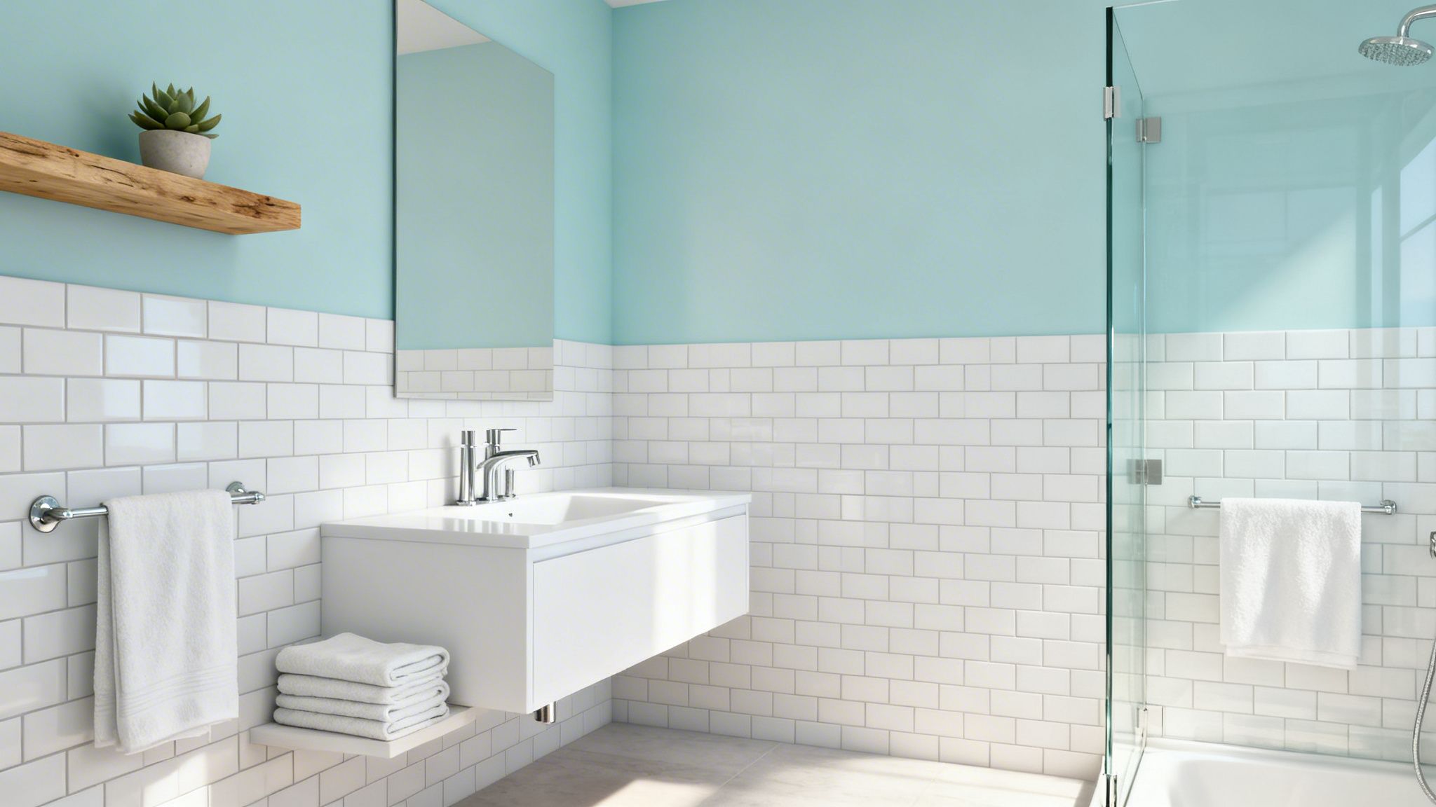
Popularized by Restoration Hardware's design collections and contemporary spa designers, these colors bring a touch of coastal elegance to any bathroom. They work particularly well in homes aiming for a classic New England aesthetic, especially when paired with crisp white trim and fixtures.
Implementation and Popular Choices
The specific shade of blue or aqua can dramatically alter a room's mood. Consider these popular examples seen in local projects:
- Benjamin Moore 'Palladian Blue' (HC-144): A soft, airy blue with green undertones, this color is a staple in Stamford, CT, luxury renovations for its chameleon-like ability to shift with the light.
- Sherwin-Williams 'Sea Salt' (SW 6204): A subtle green-gray-blue, this shade is a favorite for waterfront properties in Fairfield County, creating a seamless connection to the coastal surroundings.
- Behr 'Light Aqua' (P450-2): This refreshing color has been successfully applied in commercial spas throughout Hartford County, CT, where it adds a clean and rejuvenating feel.
- Farrow & Ball 'Borrowed Light' (No. 235): Known for its luminous quality, this pale blue is frequently specified for upscale Westchester County, NY, bathrooms to maximize natural light.
Actionable Tips for a Perfect Finish
- Test Samples Thoroughly: Blue tones are notoriously sensitive to light. Test samples on multiple walls and observe them at different times of day to see how the color shifts with natural and artificial lighting.
- Finish is Key: Just like with whites, a satin or semi-gloss finish is a practical necessity in a bathroom. These sheens are built to handle moisture, resist mildew, and are simple to wipe down.
- Balance with Warmth: To prevent the space from feeling cold, pair cool blue walls with warm elements like a natural wood vanity, brass fixtures, or beige-toned floor tiles. A project gallery of recent work can show you how these tones balance perfectly.
3. Warm Greige & Taupe
Greige, a blend of gray and beige, and its cousin taupe have become highly sophisticated neutral options. These colors are celebrated for their ability to bridge warm and cool tones, making them ideal for the varied lighting conditions found in bathrooms across Connecticut and New York. The earthy elegance of these shades provides a layer of depth without the potential starkness of pure grays, making them a top choice among interior designers and builders in our service areas.

This color family offers a complex, chameleon-like quality, shifting subtly as the light changes throughout the day. Its balanced nature makes it a perfect backdrop for a wide range of fixture finishes, from matte black to polished chrome, and it pairs beautifully with natural stone or wood accents.
Implementation and Popular Choices
The balance of warm and cool undertones in greige and taupe is key to their popularity. Here are a few examples frequently seen in local projects:
- Sherwin-Williams 'Accessible Beige' (SW 7036): A go-to for new construction and builder projects in Stamford, CT, this color has enough warmth to feel inviting but remains firmly in the neutral category.
- Benjamin Moore 'Revere Pewter' (HC-172): Often featured in high-end Westchester County, NY, homes, this light gray with warm undertones is one of the most common bathroom paint colors for its versatility and refined appearance.
- Farrow & Ball 'Hardwick White' (No. 5): This traditional gray feels more like a classic greige. It's frequently applied in designer-led projects in New Haven County, CT, where its historic depth adds character to modern bathrooms.
- Behr 'Canyon View' (N210-2): A slightly deeper taupe, this shade is popular in Hartford County residential renovations for creating a cozy, enveloping feel in larger master bathrooms.
Actionable Tips for a Perfect Finish
- Mind the Lighting: Test large, 12"x12" samples on the wall for at least a few days. Observe how the color shifts in natural morning light, artificial evening light, and on overcast days before committing.
- Finish is Key: A satin or semi-gloss finish is essential for any bathroom. These sheens are durable, moisture-resistant, and easy to clean, which is critical for maintaining walls in a high-humidity environment.
- Prevent a Washed-Out Look: Warm greige is stunning but can look bland without contrast. Pair it with crisp white trim, a dark wood vanity, or bold black fixtures to create visual interest and prevent the space from feeling monotone.
4. Soft Gray & Dove Gray
Soft gray and dove gray represent the modern neutral movement, offering chic alternatives to whites while maintaining a sense of brightness and openness. These cool-toned neutrals are particularly popular among builders and interior designers in Connecticut and Westchester County, as they provide a contemporary aesthetic that remains timeless. They are some of the most common bathroom paint colors for projects aiming for a refined, upscale atmosphere.
This color palette excels at creating a calm, understated backdrop that pairs beautifully with marble, chrome fixtures, and crisp white trim. Unlike stark whites, soft grays add a layer of depth and character to a bathroom, making the space feel more curated and intentional. The key is finding a gray with the right undertone to complement the room's lighting and existing materials.
Implementation and Popular Choices
The versatility of gray is evident in its wide application across local high-end and designer-led projects. Consider these popular examples:
- Benjamin Moore 'Coventry Gray' (HC-169): A go-to mid-tone gray used in Fairfield County contemporary bathrooms for its balanced, cool character that doesn't feel cold.
- Farrow & Ball 'Cornforth White' (No. 228): Don't let the name fool you; this is a light, understated gray. It's featured in upscale New Haven County homes for its ability to create a tranquil and effortless look.
- Behr 'Dolphin Fin' (790C-3): This light, airy gray is frequently applied in designer bathrooms throughout Westchester County, NY, to establish a modern, clean foundation.
Actionable Tips for a Perfect Finish
- Warm it Up: To avoid a clinical feel, pair cool grays with the warmth of natural wood elements, like a teak vanity or bamboo accessories. This creates a pleasing material and temperature balance.
- Test Your Light: Gray is highly susceptible to lighting changes. Test your chosen shade under both morning and evening light to see how it shifts. A gray that looks perfect in daylight might appear purple or blue at night.
- Use the Right Finish: Just as with whites, a satin or semi-gloss finish is non-negotiable for bathrooms. The higher sheen provides critical moisture resistance and makes cleaning simple, protecting the walls in a high-humidity environment.
- Create Contrast: Combine gray walls with crisp white or light wood cabinetry for a clean, modern aesthetic. Dark hardware, such as matte black faucets, can add a striking contemporary touch.
5. Pale Green & Sage
Pale green and sage tones bring a natural, organic aesthetic that is rapidly gaining favor in Connecticut and New York. As homeowners increasingly look for wellness-focused design, these earthy colors promote relaxation and a connection to nature. They achieve a sophisticated, upscale appearance perfect for both residential and commercial spaces, making them one of the most refreshing common bathroom paint colors available.
This color family evokes the tranquility of a spa, turning a functional room into a calming sanctuary. Pale greens work exceptionally well in bathrooms with good natural light, as the sunlight enhances their natural undertones and prevents them from appearing dull. They offer a modern alternative to traditional neutrals while maintaining a timeless quality.
Implementation and Popular Choices
From soft and airy to deep and moody, the right green can define a bathroom’s atmosphere. Here are some examples seen in local projects:
- Sherwin-Williams 'Sea Salt' (SW 6204): A versatile green-blue-gray, this color is a favorite in Fairfield County, CT, for creating serene environments in wellness spas and master bathrooms.
- Benjamin Moore 'Healing Aloe' (1562): Featured in contemporary homes across Westchester County, NY, this gentle green has just enough color to feel present without overwhelming the space.
- Farrow & Ball 'Pigeon' (No. 25): With its strong gray and blue undertones, this cozy sage is applied in upscale New Haven County bathrooms to create a classic, grounded look.
- Behr 'Gentle Rain' (S420-2): This light, misty green is a popular choice for residential renovations in Hartford County, CT, where it adds a subtle touch of nature.
Actionable Tips for a Perfect Finish
- Muted is Best: To maintain a sophisticated feel, choose muted sage tones. A color with a 50-60% gray tint prevents the green from becoming too vibrant, ensuring a calming effect.
- Create a Fresh Pairing: Combine pale green walls with classic white subway tile or natural stone like marble or travertine. This contrast keeps the look clean and bright.
- Choose the Right Fixtures: Brass or gold fixtures create a beautiful, upscale botanical aesthetic against a sage green backdrop. Matte black can also provide a striking modern contrast.
- Use a Moisture-Resistant Finish: As with any bathroom, a satin or semi-gloss finish is non-negotiable for durability and easy cleaning. It’s also important to ensure proper ventilation, as any potential mildew can appear more prominent against green tones.
6. Warm Beige & Sand
Warm beige and sand tones represent classic, timeless bathroom colors that have remained consistently popular across Connecticut, New York, and the Northeast. These earthy, warm neutrals create inviting, comfortable spaces while providing excellent versatility. They work well with fixtures and accessories of any style or finish, from oil-rubbed bronze to polished chrome. This color family is foundational to traditional New England design, bringing a sense of grounded comfort to historic and contemporary homes alike.
Unlike stark whites, beige offers inherent warmth that can make a bathroom feel cozier without sacrificing its bright and clean appearance. It serves as a gentle backdrop that complements natural materials like wood and stone, making it a frequent choice for creating a spa-like or nature-inspired atmosphere. For a project to feel current, the key is choosing a beige with the right undertone to avoid looking dated.
Implementation and Popular Choices
The right shade of beige can bridge the gap between classic and modern styles. Consider these popular examples seen in local projects:
- Benjamin Moore 'Manchester Tan' (HC-81): A go-to warm beige with a subtle green undertone, it’s widely used in Stamford, CT, residential projects for a reliable and sophisticated neutral base.
- Sherwin-Williams 'Accessible Beige' (SW 7036): With a balance of beige and gray, this color is a favorite in Fairfield County for traditional homes seeking a neutral that works with both warm and cool-toned fixtures.
- Behr 'Wheat Bread' (720C-3): A mid-tone beige that brings substantial warmth, this color has been applied successfully in Hartford County renovations to create a cozy and inviting environment.
- Farrow & Ball 'String' (No. 8): This earthy, yellow-based neutral is popular in upscale Westchester County, NY, bathrooms where a rich, historic feel is desired.
Actionable Tips for a Perfect Finish
- Select the Right Undertone: Choose warm beiges with yellow or red undertones to create the most inviting effect. Be mindful of undertones that can look too yellow or pink in certain lighting.
- Pair with Rich Textures: A beige bathroom pairs beautifully with darker wood cabinetry for a classic New England aesthetic. The contrast creates visual interest and a sense of timeless elegance.
- Use Warm Lighting: Combine sandy walls with warm-toned lighting (2700K-3000K) to enhance the color’s natural coziness. Cool-toned LEDs can make beige appear dull or greenish.
- Invest in a Durable Finish: A satin or semi-gloss finish provides the necessary moisture resistance for a bathroom environment. This sheen is easy to clean and helps prevent issues with mildew.
7. Soft Blush & Pale Pink
Soft blush and pale pink tones are experiencing a renaissance in bathroom design, moving far beyond dated associations to offer a fresh, contemporary approach. These subtle shades create sophisticated, often feminine-leaning spaces and are gaining traction among designers and homeowners in Fairfield County and Westchester County. The right pale pink adds warmth and personality, making it one of the more modern and stylish common bathroom paint colors available today.
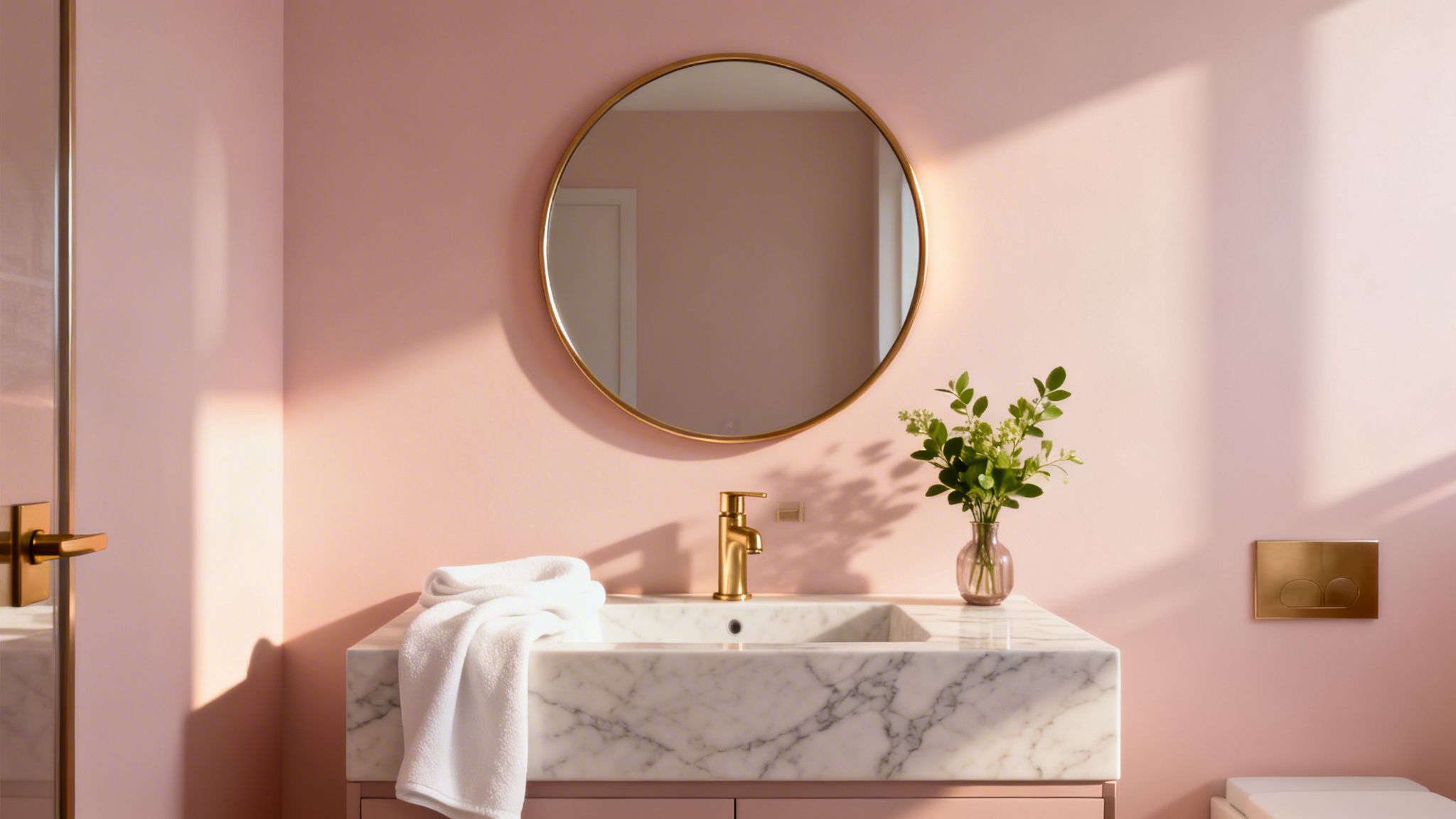
Popularized by contemporary luxury designers and lifestyle brands, these hues serve as a gentle alternative to neutral beiges or stark whites. They pair exceptionally well with high-end materials like marble and brass, creating an atmosphere of refined elegance. To achieve this look, it's essential to select a very pale, muted version of pink to maintain sophistication.
Implementation and Popular Choices
The key is subtlety. Designers often specify a tint of a more saturated pink to get the perfect muted shade. Here are examples seen in local high-end projects:
- Farrow & Ball 'Calamine' (No. 230): With its light grey undertone, this delicate pink is a favorite for designer bathrooms in New Haven County, CT, delivering a soft, traditional feel without being overly sweet.
- Benjamin Moore 'Pink Damask' (890): A pale version of this color has been featured in upscale Fairfield County bathrooms, providing a gentle glow that feels both warm and modern.
- Behr 'Pink Cadillac' (140A-2): A popular choice for luxury renovations in Stamford, CT, is to have this color tinted down by 50-75% to create a whisper of pink that is chic and understated.
Actionable Tips for a Perfect Finish
- Test Extensively: Pink undertones can shift dramatically with lighting. Test large samples on different walls and observe them throughout the day and with artificial lights on before committing.
- Pair with Luxe Materials: To elevate the color, combine it with white marble, brass or matte black fixtures, and warm wood accents. This combination is a signature of modern luxury design.
- Finish and Durability: As with any bathroom, a satin or semi-gloss finish is non-negotiable. These sheens provide excellent moisture resistance and are easy to clean, which is critical for maintaining the color's integrity.
8. Soft Charcoal & Dark Gray (Accent Walls)
Soft charcoal and dark gray tones, usually applied as accent walls rather than for all four walls, are sophisticated choices for creating drama in Connecticut bathrooms. When used strategically by professional painters, these deep colors add contemporary elegance without making smaller spaces feel crowded. An accent wall is one of the most common bathroom paint color strategies for adding a high-end, designer touch.
This approach is perfect for defining a specific zone, such as the wall behind a vanity or a freestanding tub. It provides a striking contrast that makes fixtures and decor pop, turning a functional area into a deliberate focal point. Modern architectural publications and high-end commercial designs have popularized this look.
Implementation and Popular Choices
The key is selecting a rich, complex gray that adds depth. Consider these popular examples seen in local projects:
- Sherwin-Williams 'Iron Ore' (SW 7069): A deep, saturated charcoal that creates a dramatic backdrop, often featured in contemporary Stamford, CT, lofts to highlight sleek, modern vanities.
- Benjamin Moore 'Wrought Iron' (2124-10): A soft black with gray undertones, this color is a favorite in designer bathrooms across Westchester County, NY, for its ability to feel both bold and classic.
- Behr 'Dark Kettle' (PPU18-20): This moody gray is applied in trendy Brooklyn-inspired New Haven bathrooms, typically on a single wall to add an urban, industrial feel.
- Farrow & Ball 'Railings' (No. 31): A softer alternative to pure black, it's used in upscale modern renovations in Hartford County, CT, for a timeless yet strong statement.
Actionable Tips for a Perfect Finish
- Choose the Right Wall: Apply dark gray to a single accent wall, typically the one housing the vanity or another focal point. Pair it with bright white or a light complementary color on the other walls to maximize contrast and light.
- Finish for Durability: A satin or semi-gloss finish is critical. These sheens are durable, easy to clean, and the slight light reflection helps prevent the dark color from feeling too flat or absorbing all the light.
- Light it Right: Excellent lighting is non-negotiable. Ensure you have strong vanity lights and overhead fixtures to keep the space feeling bright. The team at CP Painting Company always recommends a professional application, as dark colors are unforgiving and show imperfections easily.
Comparison of 8 Common Bathroom Paint Colors
| Color | 🔄 Implementation Complexity | ⚡ Resource Requirements | ⭐ Expected Outcomes | 📊 Ideal Use Cases | 💡 Key Advantages / Tips |
|---|---|---|---|---|---|
| Soft White & Cream | Low 🔄 — straightforward prep and finish selection | Low ⚡ — standard semi-gloss/satin, minimal labor | Bright, spa-like, maximizes light ⭐⭐⭐⭐ | Small bathrooms, resale-focused renovations 📊 | Versatile neutral; choose warm undertones and test under room lighting 💡 |
| Pale Blue & Soft Aqua | Low–Moderate 🔄 — shade choice critical to avoid coldness | Moderate ⚡ — may need extra lighting and careful tinting | Calming, spa-like, modern appeal ⭐⭐⭐ | Coastal, naturally lit bathrooms, spas 📊 | Hides water spots better; pair with warm wood and test at different times of day 💡 |
| Warm Greige & Taupe | Moderate 🔄 — undertone selection requires review | Moderate ⚡ — sample panels and time for evaluation | Sophisticated, adaptable across styles ⭐⭐⭐⭐ | Open-concept homes, contemporary/traditional transitions 📊 | Masks imperfections; request multi-day samples and pair with contrasting cabinetry 💡 |
| Soft Gray & Dove Gray | Moderate 🔄 — undertone sensitivity important | Moderate ⚡ — sample testing; quality finish to avoid streaks | Modern, clean backdrop for fixtures ⭐⭐⭐⭐ | Contemporary, minimalist designs, new construction 📊 | Works well with metal finishes; use warmer grays in low-light spaces 💡 |
| Pale Green & Sage | Moderate 🔄 — careful shade to avoid institutional look | Moderate ⚡ — pairing with natural materials and lighting checks | Natural, wellness-focused aesthetic ⭐⭐⭐ | Wellness-focused homes, botanical-inspired bathrooms 📊 | Choose muted tints; combine with stone/wood and brass accents 💡 |
| Warm Beige & Sand | Low 🔄 — straightforward application | Low ⚡ — common materials and finishes | Inviting, timeless, broadly appealing ⭐⭐⭐⭐ | Traditional homes, broad resale markets 📊 | Universally appealing; use warmer undertones and darker cabinetry for contrast 💡 |
| Soft Blush & Pale Pink | Moderate 🔄 — tint down to very pale versions; lighting sensitive | Moderate ⚡ — careful sampling and pairing with luxury finishes | Distinctive, contemporary feminine-leaning look ⭐⭐⭐ | Design-forward, upscale bathrooms, marble settings 📊 | Use very pale tints; pair with brass/white marble and test light shifts 💡 |
| Soft Charcoal & Dark Gray (Accent) | High 🔄 — professional application recommended for precision | High ⚡ — skilled labor, quality finish, controlled lighting | Dramatic, high-design focal point when correct ⭐⭐⭐⭐ | Accent walls behind vanities, modern/industrial spaces 📊 | Apply to a single focal wall; ensure strong contrast and hire pros for crisp results 💡 |
Bring Your Vision to Life with Professional Precision
Choosing from this curated list of common bathroom paint colors is a significant first step, but it’s only half the battle. As we've explored, the true art of a bathroom transformation lies in the details. The success of a soft white depends entirely on its undertones interacting with your specific lighting, while the calming effect of a pale blue can be lost without proper surface preparation that ensures a smooth, even finish. The sophisticated drama of a charcoal accent wall requires perfectly crisp lines to look intentional and high-end, not messy.
Mastering these nuances is what elevates a simple paint job into a durable, professional-grade design statement. Beyond just the hue itself, the final result is a product of several critical factors that require a skilled hand.
Key Takeaways for a Flawless Finish
- Sheen Matters: Remember that a higher-sheen finish, like satin or semi-gloss, is not just a style choice; it’s a functional one. These finishes offer superior resistance to moisture and are easier to clean, which is essential in a high-humidity environment like a bathroom.
- Preparation is Paramount: The most beautiful color will fail if applied to a poorly prepared surface. Proper cleaning to remove soap scum and mildew, followed by sanding and priming, is non-negotiable for a lasting finish that won't peel or bubble.
- Moisture-Resistant Paint is a Must: Standard interior paint is not designed to withstand the constant humidity and temperature fluctuations of a bathroom. Investing in a quality, mildew-resistant bathroom paint will protect your walls and your investment for years to come.
- Lighting is Everything: A color swatch can look completely different in the store versus in your home. Always test your chosen colors on the actual walls of your bathroom and observe them at different times of day to see how they interact with both natural and artificial light sources.
Bringing these elements together is where professional expertise becomes invaluable. For homeowners and builders in Connecticut, understanding local style preferences-such as the classic coastal appeal of soft aquas in Fairfield County or the timeless, historic look of warm greiges in older Stamford homes-adds another layer of complexity. A professional painter not only executes the technical aspects flawlessly but also provides insights into how these common bathroom paint colors perform within the context of local architecture and lighting conditions. This ensures the final look is not just beautiful, but also cohesive and appropriate for your home’s style and value.
Transforming your space with one of these popular bathroom paint colors requires precision and expertise. The team at CP Painting Company has been serving Stamford, Fairfield County, and Westchester County for years, delivering flawless results that stand the test of time. Let us handle the details, from surface preparation to the final coat, ensuring your vision becomes a stunning, durable reality. Contact us for a free estimate and see how professional application makes all the difference: CP Painting Company.


