
An accent wall is more than just a splash of paint; it's a strategic design choice that can alter the mood, perceived size, and style of any space. A single, well-chosen color can create a focal point, add depth, or introduce a personality that was missing from the room's existing design. But with so many options, how do you find the right one? The wrong choice can overwhelm a room rather than elevate it, making the decision feel more stressful than it should be.
This guide cuts through the noise. We will provide ten specific, actionable accent wall color ideas designed for homes across Connecticut and New York. You'll discover palettes suited for everything from Stamford's modern condos to Fairfield County's traditional estates.
Drawing on expert insights from CP Painting Company, we'll cover critical details beyond just the main color. You'll get practical advice on complementary color pairings, ideal paint finishes for different lighting conditions, and professional application notes. This isn't just a list of colors; it's a direct guide to help you find the perfect shade and confidently bring your vision to life. Let's find the single wall that will redefine your room.
1. Deep Navy Blue Accent Wall
A deep navy blue accent wall is a timeless and commanding choice, creating dramatic contrast and a sense of refined stability. This particular accent wall color idea is perfect for adding depth to a room without making it feel smaller, especially when used correctly. The dark, rich tone acts as a powerful backdrop that can make both light and bold furnishings stand out. It’s a popular option for master bedrooms in Fairfield County estates and executive offices in Stamford, where a professional yet inviting atmosphere is key.
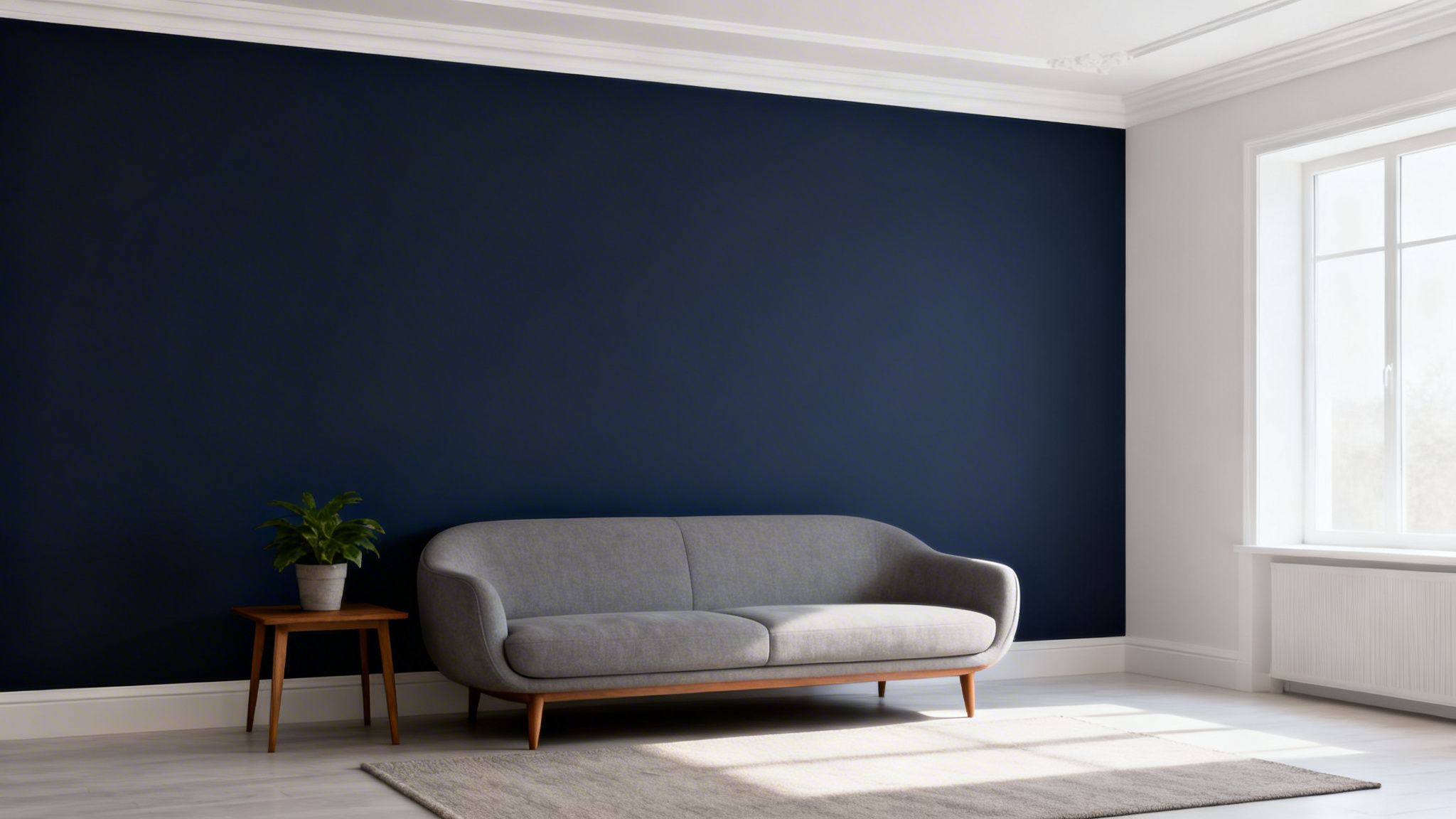
This color's strength lies in its versatility. While it provides a bold statement, navy blue is still a classic neutral that pairs well with a wide range of colors and materials, from crisp whites and warm woods to metallic accents like brass or gold. This adaptability makes it one of the most enduring accent wall color ideas for both modern and traditional interiors.
Implementation Tips for a Navy Accent Wall
To get the most out of your navy blue feature wall, consider these practical tips:
- Maximize Light: Pair it with bright white trim and a white ceiling. This contrast creates sharp, clean lines and helps reflect natural light around the room, keeping it from feeling too dark.
- Warm Lighting: Integrate warm-toned lighting (bulbs around 2700K-3000K) to balance navy's cool undertones. This prevents the space from appearing cold or stark, especially in the evening.
- Proper Prep: Always start with a high-quality primer, preferably a tinted one. Deep colors like navy often require a solid base for even coverage and true color representation, reducing the number of coats needed. You can review our team’s process to see how professional preparation makes a difference.
- Test Your Shade: Navy blues can vary significantly, with undertones ranging from gray and green to purple. Sample several shades on your wall to see how they interact with your room’s specific lighting throughout the day.
2. Warm Sage Green Accent Wall
A warm sage green accent wall introduces a calming, nature-inspired feel, bridging the gap between a soft green and a neutral gray. This creates a serene and balanced atmosphere, making it one of the most sought-after accent wall color ideas for homeowners seeking tranquility. Its earthy tone connects the indoor space to the outdoors, a key principle of biophilic design that is popular in master bathrooms in Westchester County and wellness spaces across Connecticut.
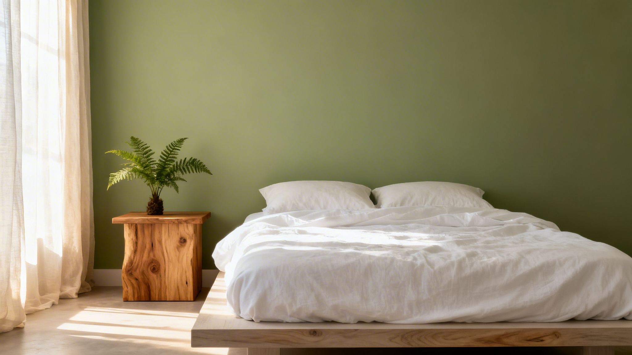
The appeal of sage green lies in its understated sophistication. It provides a touch of color without overwhelming the senses, acting as a gentle backdrop for contemporary kitchens in Stamford or bedroom accent walls in New Haven. It pairs beautifully with natural wood elements, crisp whites, and other warm neutrals, creating an organic and cohesive look.
Implementation Tips for a Sage Green Accent Wall
To make your sage green feature wall look its best, consider these practical tips:
- Choose the Right Finish: A matte or eggshell finish is ideal for sage green. These low-sheen options absorb light, which enhances the color's soft, velvety appearance and minimizes surface imperfections for a more sophisticated result.
- Pair with Natural Materials: Maximize the biophilic effect by combining your sage accent wall with natural wood furniture, woven textures like jute or rattan, and plenty of live plants.
- Test in Different Lights: Sage green can shift in appearance, looking more gray in low light and greener in bright light. Always test paint swatches on your wall to see how the color interacts with your room's natural and artificial lighting throughout the day.
- Use Soft White Trim: Avoid stark, cool whites for your trim. Instead, opt for a soft or creamy white to complement the warm undertones in the sage green, ensuring a harmonious and gentle contrast. You can see how we apply and recommend paint color palettes for your project.
3. Charcoal Gray Accent Wall
A charcoal gray accent wall offers a sophisticated and moody alternative to black, providing strong contrast with a softer, more grounded feel. This versatile neutral is a cornerstone of modern design, creating an elegant backdrop that works in nearly any room. It’s an ideal accent wall color idea for adding depth and a sense of architectural intention, popular in contemporary lofts in Stamford and modern master bedrooms throughout Fairfield County. The color’s inherent stability makes it a professional choice favored by architects and designers.
Charcoal gray's power comes from its chameleon-like ability to support diverse design palettes. It pairs beautifully with rich textures like leather and velvet, natural materials like light wood and stone, and vibrant pops of color from artwork or decor. This adaptability ensures it remains a stylish and practical choice, allowing homeowners to update their decor over time without needing to repaint.
Implementation Tips for a Charcoal Gray Accent Wall
To ensure your charcoal gray accent wall achieves the desired effect, follow these professional tips:
- Warm Up the Space: Charcoal has cool undertones, so integrate warm-toned lighting (bulbs around 2700K) to keep the room from feeling stark or uninviting. This is especially important in home offices and living areas.
- Create Definition: Use crisp white or a soft off-white for the trim and ceiling. This contrast makes the charcoal color pop and gives the room a clean, finished look.
- Showcase Art: This deep, neutral background is perfect for making a statement art piece the focal point. Consider installing accent lighting, like a picture light, directly above the art to highlight it against the dark wall.
- Test for Undertones: Sample your chosen charcoal shades on the wall and observe them in both morning and evening light. Some charcoals pull blue, green, or brown, and the room's natural and artificial lighting will affect the final appearance.
4. Rich Burgundy or Wine Red Accent Wall
A rich burgundy or wine red accent wall introduces an element of luxury and drama, enveloping a space in warmth and sophistication. This particular accent wall color idea is a bold choice that creates an inviting, opulent atmosphere. It’s perfect for formal dining rooms in Fairfield County estates or entertainment spaces in Stamford where a memorable impression is desired. The deep, saturated hue makes a powerful statement while retaining a classic, professional feel suitable for executive offices.
This color's appeal comes from its ability to feel both grand and intimate. Burgundy pairs beautifully with rich materials like dark woods, leather, and velvet, as well as metallic accents such as gold or bronze. This makes it an excellent option for adding a touch of traditional elegance or creating a cozy, high-end retreat in modern and transitional homes alike.
Implementation Tips for a Burgundy Accent Wall
To successfully integrate a burgundy or wine-red feature wall, consider these practical tips:
- Balance with Light: Use this color in rooms with ample natural light to prevent the space from feeling too heavy. Pair it with a crisp white or warm cream ceiling to lift the room and avoid a cavelike atmosphere.
- Warm Lighting: Employ warm-toned artificial lighting (bulbs around 2700K) to enhance the color's inherent warmth and create a cozy, welcoming glow in the evening.
- Quality Primer: A high-quality, tinted primer is essential. Deep reds are notorious for needing multiple coats for even coverage, and a proper base will ensure a truer, richer color finish with less paint.
- Fabric and Texture: Complement the wall with rich fabrics and textures. Think velvet curtains, plush rugs, or leather furniture to build a layered, sophisticated look that highlights the color's depth.
5. Soft Blush or Warm Taupe Accent Wall
A soft blush or warm taupe accent wall introduces a gentle, contemporary warmth that feels both sophisticated and comforting. These modern neutrals offer an alternative to stark whites or beiges, providing warmth and a hint of feminine elegance without being overtly pink. This type of accent wall color idea has become a favorite in Connecticut residential design, especially for creating serene sanctuaries in bedrooms, bathrooms, and nurseries across Westchester County. The subtle, earthy tones create a calming backdrop that is both stylish and timeless.
The appeal of soft blush and warm taupe lies in their ability to act as a "new neutral." These colors pair beautifully with a wide array of textures and materials, from natural woods and crisp linens to warm metals like brass and rose gold. This versatility makes them an excellent choice for gallery-style living rooms in New Haven County, where the wall color needs to complement art without competing with it.
Implementation Tips for a Blush or Taupe Accent Wall
To perfect your soft and warm feature wall, consider these practical tips:
- Test in All Lights: These shades are chameleons; they can shift from beige to pink to gray depending on the light. Test large swatches on your wall and observe them in morning, afternoon, and evening light before committing.
- Define with Trim: Use a crisp white or a soft off-gray for trim and ceiling paint. This creates a clean, defined border that makes the blush or taupe color pop, adding structure to the softness.
- Pair with Textures: Combine your accent wall with natural textures like rattan, light-colored wood, linen curtains, and chunky knit throws. These elements enhance the color’s inherent warmth and create a cozy, layered look.
- Choose the Right Finish: A matte or eggshell finish works best for these colors, as it minimizes sheen and enhances their soft, velvety appearance. This finish helps hide minor wall imperfections and contributes to a more high-end feel, a standard our team at CP Painting Co. always aims for.
6. Deep Forest Green Accent Wall
A deep forest green accent wall introduces dramatic elegance and a strong connection to nature. This rich, jewel-toned color is one of the most sophisticated accent wall color ideas, creating a sense of organic opulence and grounding the space. It has become a favored choice for adding character to home libraries in Connecticut estates and formal dining rooms in Fairfield County, where it provides depth and a traditional, enveloping feel.
Inspired by British and European design, this color's appeal is in its ability to be both bold and calming. It pairs exceptionally well with natural wood tones, leather, and metallic finishes like brass or bronze, amplifying its luxurious quality. This makes forest green an excellent choice for rooms meant for concentration or intimate conversation, such as a study or a cozy den.
Implementation Tips for a Forest Green Accent Wall
To ensure your forest green accent wall is a success, follow these specific guidelines:
- Consider the Finish: A matte or flat finish is often preferred for deep greens. It absorbs light, creating a soft, velvety texture that minimizes surface imperfections and gives the color a richer, more profound appearance.
- Balance with Lightness: Use crisp cream or off-white for trim, ceilings, and adjacent walls. This contrast will define the accent wall and keep the room from feeling overly dark or heavy.
- Embrace Natural Elements: Enhance the organic feel by incorporating natural materials. Add indoor plants, rich wood furniture, or stone accessories to create a cohesive, nature-inspired design.
- Warm Metals are Key: Pair forest green with warm metal accents. Brass light fixtures, gold-framed mirrors, and bronze hardware provide a beautiful contrast that illuminates the green's deep tones.
7. Warm Terracotta or Burnt Orange Accent Wall
A warm terracotta or burnt orange accent wall introduces an earthy, energetic vibe, bringing Mediterranean or southwestern flair to Connecticut homes. This dynamic accent wall color idea is perfect for creating inviting, high-energy spaces. Its rich, sun-baked hue stimulates conversation and appetite, making it a stellar choice for social hubs like kitchens and dining rooms. We often see this color requested for kitchen accent walls in Fairfield County homes and dining areas in Stamford where it adds a splash of personality.
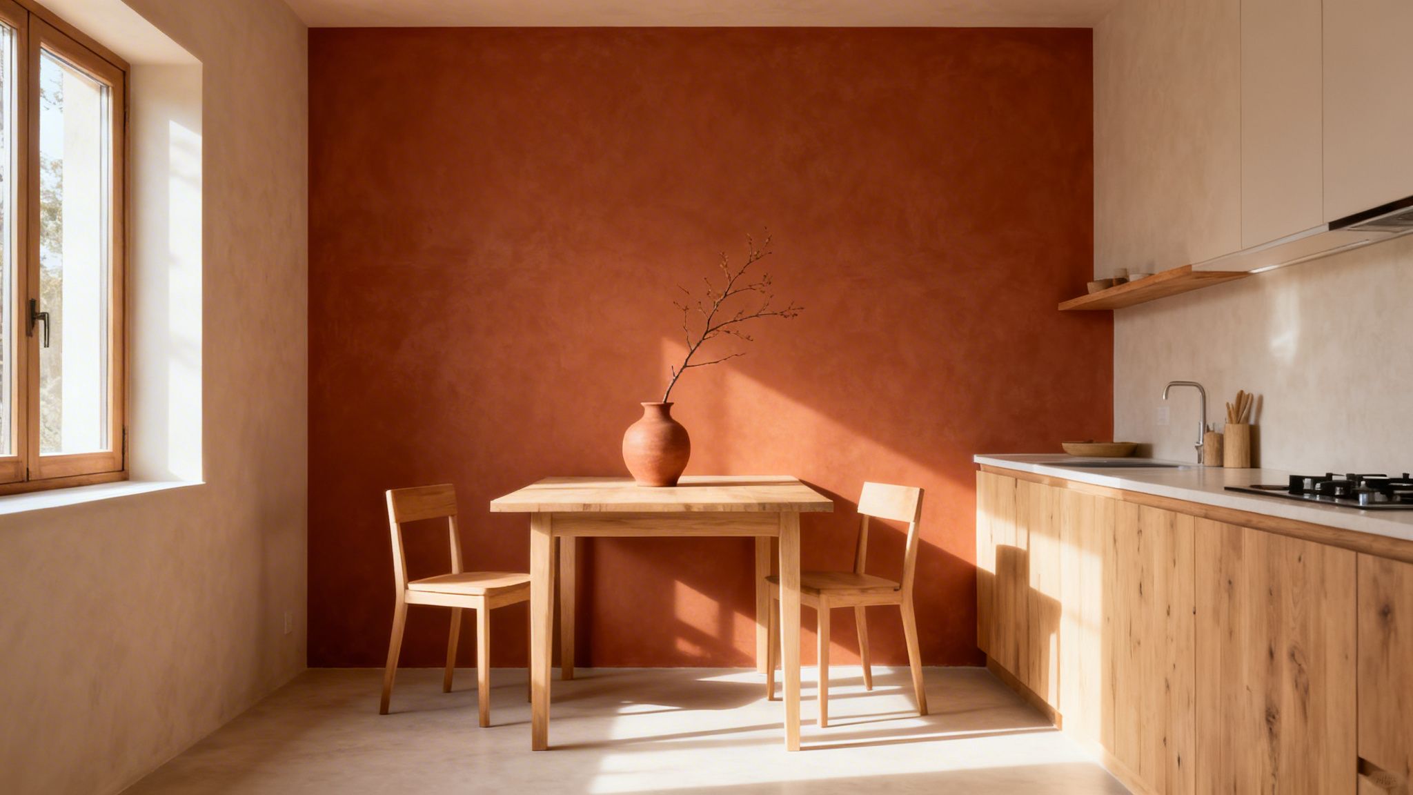
This color's appeal comes from its ability to feel both rustic and contemporary. Terracotta and burnt orange connect a room to natural elements while still providing a bold, modern statement. They pair beautifully with natural woods, creamy whites, and deep greens, offering a versatile palette that can be adapted for rustic farmhouse or sleek modern designs.
Implementation Tips for a Terracotta Accent Wall
To make your warm terracotta or burnt orange feature wall a success, follow these specific guidelines:
- Balance with Neutrals: These are powerful colors. Ensure the other three walls are a soft, neutral shade like off-white, light beige, or a very pale gray to keep the room from feeling overwhelmed.
- Embrace Natural Materials: Complement the earthy tone by pairing it with natural wood cabinetry, stone countertops, or jute and rattan accessories. This enhances the organic, grounded feeling of the space.
- Use Warm Lighting: Like a navy wall, terracotta benefits from warm-toned lighting (bulbs in the 2700K-3000K range). This will amplify its cozy, inviting qualities, especially in the evening.
- Prime for Depth: Vibrant, earthy tones like terracotta and burnt orange require a solid foundation. Using a tinted primer ensures the final color is rich and true, often reducing the need for a third coat of paint.
- Test Your Hue: Terracotta can range from a pinkish-brown to a deep, fiery orange. Always paint large test swatches on the intended wall to observe how the color shifts with the natural and artificial light in your room.
8. Soft White or Cream with Subtle Gray Undertone Accent Wall
An accent wall doesn't always have to be a bold, dramatic color. A soft white or cream with a subtle gray undertone offers a refined and sophisticated approach to creating definition. This is one of the more nuanced accent wall color ideas, ideal for homeowners seeking understated elegance. Instead of commanding attention with high contrast, it gently separates spaces and highlights a room’s best features, like intricate crown molding or a beautiful window. This approach is popular in contemporary Stamford homes and light-filled properties across Fairfield County where architectural details are meant to be the star.
The strength of this color choice is its ability to create depth without overwhelming the senses. It’s a favorite in minimalist and Scandinavian designs, providing a soft backdrop that feels clean, airy, and intentional. For farmhouse and cottage-style homes in Litchfield County, a creamy off-white accent wall adds warmth and texture, making the space feel cozy yet modern.
Implementation Tips for a Soft White Accent Wall
To make this subtle statement effective, precision is key. Follow these tips for a flawless finish:
- Create Subtle Contrast: Paint the adjacent walls in a pure, crisp white. This slight variation in tone is what creates the "accent" effect, making the feature wall stand out in a sophisticated way.
- Emphasize Texture: Since the color contrast is minimal, consider using a different paint finish. A matte finish on the accent wall next to eggshell on the other walls can create a beautiful, textural difference.
- Test in All Lights: Off-whites are highly susceptible to changes in light. Test your chosen shade on the wall and observe it in bright daylight, on a cloudy day, and under your artificial lighting to ensure the gray undertone reads as intended.
- Use Quality Tools: For a perfectly smooth, uniform finish, use high-quality brushes for cutting in and premium rollers. This prevents streaks and lap marks, which are more visible with light colors. Our professional painters often use this technique for a flawless application.
9. Bold Black or Charcoal Black Accent Wall
A bold black or charcoal black accent wall delivers maximum drama and contemporary sophistication. This accent wall color idea creates an intense focal point, making it a powerful choice for modern interiors. Black walls provide unmatched depth, allowing artwork, furniture, and metallic fixtures to command attention. It is an increasingly popular statement in modern lofts in Stamford and minimalist Westchester County homes, where a confident, curated aesthetic is desired.
The power of a black accent wall is its ability to create a gallery-like feel. It absorbs light, which makes the colors and textures placed against it appear more vibrant and defined. This makes it an excellent choice for entertainment rooms, home studios, and even powder rooms where you want to make a bold, elegant statement in a compact space.
Implementation Tips for a Black Accent Wall
To successfully execute this daring accent wall color idea, consider the following recommendations:
- Ensure Ample Lighting: Black walls thrive in well-lit spaces. Combine bright, natural light with layered artificial lighting, such as track lights or picture lights, to highlight the wall and prevent the room from feeling cavernous.
- Select a High-Quality Paint: Not all black paints are created equal. Choose a high-quality, true black or deep charcoal paint with a matte or eggshell finish to minimize reflections and achieve a rich, velvety look.
- Prep for a Flawless Finish: Dark colors are unforgiving of wall imperfections. Meticulous surface preparation, including patching and sanding, is critical. Using a dark-tinted primer will help you get deep, even coverage with fewer topcoats.
- Balance with Texture and Color: Soften the boldness of black by pairing it with warm woods, plush textiles, and pops of color. Metallic accents in brass, chrome, or gold add a touch of glamour and reflect light, creating a dynamic contrast.
10. Warm Mustard Yellow or Golden Yellow Accent Wall
A warm mustard or golden yellow accent wall injects a dose of cheerful energy and inviting warmth into a space. This accent wall color idea has seen a major resurgence, moving away from bright, primary yellows to more sophisticated, earthy tones. It is an excellent choice for creating a welcoming focal point in active areas of the home, such as kitchens, breakfast nooks, and entryways. In Fairfield County homes, a golden yellow accent wall can bring a sense of sunshine and optimism, even on overcast days.
This color's appeal comes from its ability to feel both energizing and grounding. Unlike more vibrant yellows, a muted mustard has an inherent depth that pairs beautifully with natural materials like wood and stone, as well as with crisp whites and deep blues. This makes it a versatile option for transitional, farmhouse, and even eclectic design styles, providing a modern yet timeless statement.
Implementation Tips for a Mustard Yellow Accent Wall
To ensure your yellow accent wall is sophisticated rather than overwhelming, follow these guidelines:
- Choose the Right Tone: Opt for a warm, muted mustard or a rich golden hue over a bright, pure yellow. These deeper tones have more complex undertones that add a level of refinement to the room.
- Balance with Neutrals: Pair your yellow accent wall with crisp white trim, cabinets, or neutral-colored furniture. This contrast keeps the look fresh and prevents the yellow from dominating the space.
- Use in Well-Lit Areas: Yellows look their best in spaces with ample natural light. The sunlight enhances their warmth and prevents them from looking dull or murky. It's a fantastic choice for a kitchen or home office in a Stamford residence.
- Test Extensively: Yellow shades can change dramatically depending on the light. Before committing, paint large sample swatches on the intended wall and observe them at different times of the day to ensure you love the color in all its variations.
Top 10 Accent Wall Colors Compared
| Accent Color | 🔄 Implementation Complexity | ⚡ Resource Requirements | ⭐ Expected Outcomes | 📊 Ideal Use Cases | 💡 Key Advantages |
|---|---|---|---|---|---|
| Deep Navy Blue Accent Wall | Medium — requires primer and careful application | Moderate–High — quality paint, primer, good lighting | ⭐⭐⭐⭐ — dramatic, elegant depth | Living rooms, bedrooms, home offices, executive offices | Timeless versatility; hides imperfections; pairs with metallics |
| Warm Sage Green Accent Wall | Low–Medium — test samples and finish | Moderate — quality paint, lighting tests | ⭐⭐⭐ — calming, balanced ambiance | Bedrooms, bathrooms, home offices, living rooms | Promotes relaxation; biophilic, eco-conscious appeal |
| Charcoal Gray Accent Wall | Medium — needs smooth finish and lighting plan | Moderate — premium paint, possible accent lighting | ⭐⭐⭐⭐ — versatile, contemporary neutral | Home offices, living rooms, bedrooms, commercial spaces | Neutral backdrop that enhances art and décor |
| Rich Burgundy / Wine Red Accent Wall | Medium–High — multiple coats and lighting design | High — primer, several coats, warm lighting | ⭐⭐⭐⭐ — warm, luxurious, dramatic | Dining rooms, libraries, wine cellars, executive offices | Opulent, intimate atmosphere; pairs with rich fabrics and metals |
| Soft Blush / Warm Taupe Accent Wall | Low — straightforward but test undertones | Low–Moderate — quality paint, sample testing | ⭐⭐⭐ — subtle, sophisticated warmth | Bedrooms, bathrooms, powder rooms, living rooms | Universally flattering; excellent art backdrop |
| Deep Forest Green Accent Wall | Medium–High — requires lighting and pairing consideration | High — quality paint, complementary finishes, good lighting | ⭐⭐⭐⭐ — rich, jewel-toned sophistication | Libraries, studies, dining rooms, master bedrooms | Connects to nature; complements traditional architectural details |
| Warm Terracotta / Burnt Orange Accent Wall | Medium — coverage and tone testing important | Moderate — primer, samples, balanced lighting | ⭐⭐⭐ — warm, energetic, hospitable | Kitchens, dining areas, family rooms, entryways | Inviting warmth; complements wood and stone materials |
| Soft White / Cream w/ Subtle Gray Undertone | Low–Medium — smooth finish and color testing | Moderate — high-quality paint to avoid sheen issues | ⭐⭐⭐⭐ — clean, refined subtle contrast | Living rooms, bedrooms, bathrooms, entryways | Timeless neutrality; highlights trim and architecture |
| Bold Black / Charcoal Black Accent Wall | High — precise prep and professional lighting needed | High — premium black paint, targeted lighting | ⭐⭐⭐⭐ — maximum drama and depth | Media rooms, galleries, lofts, feature walls | Dramatic focal point; excellent for showcasing artwork |
| Warm Mustard / Golden Yellow Accent Wall | Medium — careful shade selection required | Moderate — samples and lighting evaluation | ⭐⭐⭐ — cheerful, brightening effect | Kitchens, entryways, bathrooms, home offices | Warmth and optimism; enhances natural light and energy |
Bring Your Vision to Life with Professional Precision
Choosing the perfect hue for an accent wall is an exciting first step in redefining your space. As we've explored, the right color can do so much more than just cover a surface; it can establish a mood, create a focal point, and completely alter the perception of a room's dimensions and light. From the grounding stability of a charcoal gray wall in a Fairfield County living room to the inviting warmth of terracotta in a Westchester kitchen, the potential for personal expression is immense.
We've covered a spectrum of powerful accent wall color ideas, each with its own character and strategic application. You've seen how deep navy blue brings a sense of sophisticated calm, while a pop of golden yellow introduces energy and optimism. Similarly, the organic feel of sage green connects a space to nature, and the boldness of a pure black wall delivers high-impact, modern drama. These are not just colors; they are tools for crafting an environment that truly reflects your personal style and enhances your daily life.
From Inspiration to Impeccable Execution
Mastering these concepts is about more than just picking a favorite swatch from a lineup. It’s about understanding the "why" behind the choice.
- Light & Sheen: Recognizing how natural and artificial light interacts with a finish, whether it's a matte, eggshell, or satin, is crucial. Darker colors like burgundy or forest green absorb light and require careful planning to avoid making a room feel too small, while softer tones like blush or off-white can brighten a space.
- Surface Preparation: The success of any accent wall, especially one with a dark or bold color, depends almost entirely on the preparation. Flawless application requires a perfectly smooth, clean, and primed surface. Any imperfections will be magnified by high-contrast colors.
- Precision & Technique: Achieving crisp, clean lines where the accent wall meets the ceiling, trim, and adjacent walls is a hallmark of quality work. This requires a steady hand, the right tools, and a methodical approach to cutting in and rolling, which is especially important for maintaining color consistency with deep pigments.
Ultimately, an accent wall is a statement. It’s a deliberate design choice that declares your aesthetic. A poorly executed accent wall, with visible streaks, uneven coverage, or messy edges, sends the wrong message. A professionally painted wall, however, elevates the entire room, demonstrating a commitment to quality and detail that adds tangible value to your home. It turns a simple idea into a stunning, durable feature that you can be proud of for years to come.
Ready to turn your inspiration into a flawlessly finished reality? The team at CP Painting Company specializes in precision interior painting, ensuring your accent wall makes the exact statement you envision. Serving Stamford, CT, and the surrounding Fairfield and Westchester Counties, we bring expertise and meticulous care to every project. Contact us today for a free, detailed estimate and let our professionals handle the details.


