
Grey has long been the go-to neutral for homeowners in Connecticut and New York, but its true power lies in the colors it’s paired with. Choosing the right companion shade can transform a simple grey from stark and cold to warm, inviting, and full of character. The wrong choice, however, can make an otherwise beautiful room feel dated or unwelcoming. This guide is built for discerning homeowners, designers, and contractors in Fairfield, Westchester, and the surrounding counties who need practical, reliable color advice.
We will move beyond generic suggestions to provide specific, actionable palettes that work with the unique lighting and architectural styles of our region. You'll learn how to identify grey's undertones, from cool blues to warm beiges (greige), and discover which colors that go with grey will create a professional, intentional design. From selecting the perfect Benjamin Moore or Sherwin-Williams paint codes for a Stamford condo to finding the right trim color for a Litchfield County colonial, this list delivers clear guidance.
Let's explore the top 10 color combinations that elevate grey from a simple background to the foundation of exceptional interior and exterior design.
1. Grey and White – The Classic Neutral Foundation
The combination of grey and white is a timeless pairing that forms a clean, adaptable foundation for any interior or exterior project. Grey acts as a versatile base, while crisp white provides brightness and contrast, adding visual depth without overwhelming the space. This duo is a reliable choice for achieving a modern and open feel, particularly in residential and commercial settings across Fairfield County and Westchester County where maximizing natural light is often a priority.
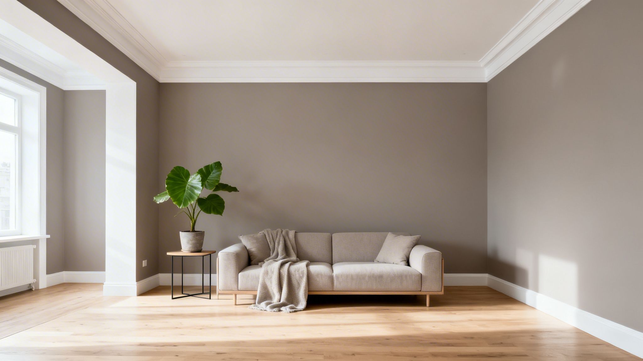
Popularized by the Scandinavian design movement and the minimalist aesthetic seen in high-end retail like Apple Stores, this palette is about more than just simplicity. It’s about creating a calm, collected environment that feels both intentional and enduring. From contemporary condos in NYC to modern office spaces in Stamford, this combination delivers a polished look that stands the test of time.
Practical Tips for a Grey and White Palette:
- Choose Warm Greys: To avoid a sterile or cold atmosphere, especially with Connecticut's changing light, opt for warm greys (greige) with beige or yellow undertones. A popular choice is Benjamin Moore's "Revere Pewter" (HC-172).
- Create Balance with White: Use a pure white like Sherwin-Williams' "Extra White" (SW 7006) on trim, ceilings, and doors to create sharp, clean lines that make the grey walls pop. This technique, as seen in many successful projects, defines architectural details.
- Layer with Natural Textures: Introduce warmth and prevent monotony by layering natural wood elements, such as white oak flooring, a walnut side table, or jute rugs.
- Test Your Samples: Always test paint samples on different walls. The light from a north-facing window in Greenwich will make a grey look much cooler than the light from a south-facing window in a White Plains home.
2. Grey and Navy Blue – Sophisticated Professional Elegance
The combination of grey and navy blue creates a powerful and refined palette, bringing depth and a sense of professional polish to any space. Navy acts as a strong, grounding anchor, while grey provides a soft, neutral backdrop that keeps the look modern. This pairing is a go-to for designers and builders looking to establish a calming yet authoritative atmosphere in Fairfield County business offices and upscale Westchester County residential properties.

Popularized by Ralph Lauren Home collections and luxury hotel designs, this duo conveys confidence and stability. It's frequently seen in executive boardrooms in Stamford, high-end NYC apartment renovations, and stately master bedrooms where a classic, enduring style is desired. The combination of these two colors that go with grey results in an elegant and grounded aesthetic that feels both traditional and current.
Practical Tips for a Grey and Navy Blue Palette:
- Establish a Clear Hierarchy: Use a light or mid-tone grey, like Benjamin Moore's "Stonington Gray" (HC-170), as the primary wall color. Then, introduce a rich navy like Sherwin-Williams' "Naval" (SW 6244) on an accent wall or built-in cabinetry.
- Balance with Brightness: To prevent the room from feeling too dark, especially in spaces with limited natural light, ensure the ceiling is a crisp white. This contrast lifts the space and keeps it from feeling heavy.
- Ground the Space: For a traditional look, consider a two-tone wall with navy on the lower third and grey above. This technique, often paired with chair rail molding, adds architectural interest and grounds the room.
- Invest in Quality Paint: Deep, saturated colors like navy blue can show imperfections if not applied correctly. Using a high-quality paint ensures even coverage and a rich, velvety finish that elevates the entire look.
3. Grey and Warm Gold/Brass Accents – Luxury Contemporary
Combining cool grey with the warmth of gold or brass creates a sophisticated, modern look that signals contemporary luxury. The metallic warmth serves as a perfect counterpoint to grey's inherent coolness, adding visual interest and preventing the palette from feeling stark or industrial. This pairing has gained significant traction in high-end residential and commercial projects across Connecticut, from luxury apartments in NYC to boutique hotels in Greenwich.
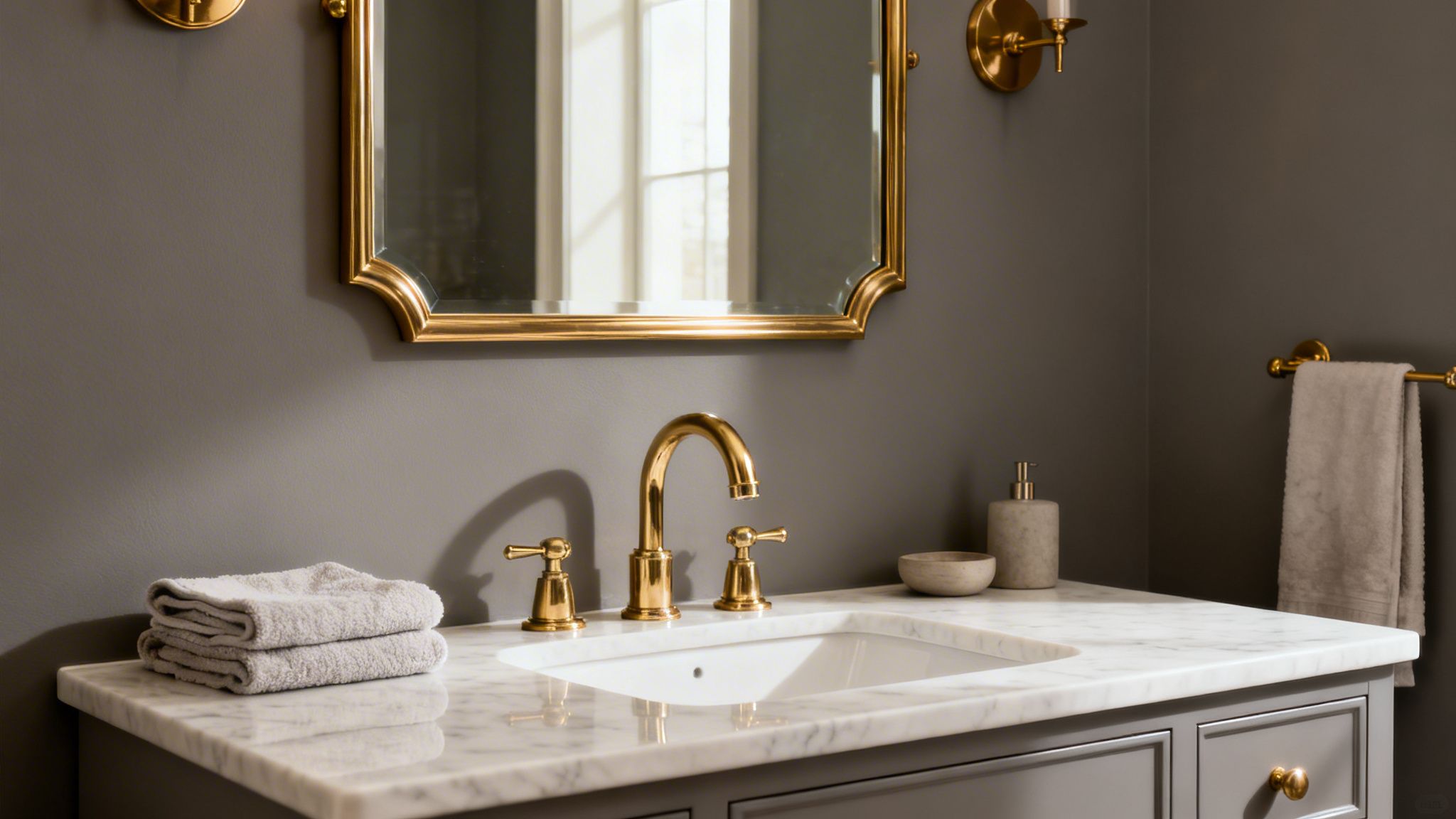
Popularized by influential interior designers and seen in contemporary art galleries, this combination brings an intentional, curated feel to any space. The juxtaposition of a neutral, often matte grey with the subtle sheen of brushed brass or polished gold creates a dynamic yet balanced aesthetic. It's an effective way to introduce richness and depth without relying on bold colors, making it a go-to for modern office spaces in Stamford and upscale homes in Westchester County.
Practical Tips for a Grey and Gold/Brass Palette:
- Mind Your Finishes: Create a subtle contrast by pairing a matte or satin finish grey paint, such as Benjamin Moore's "Coventry Gray" (HC-169), with either brushed or polished metallics. The difference in sheen adds another layer of texture.
- Incorporate Accents Strategically: Use gold or brass for hardware (cabinet pulls, door handles), light fixtures, mirror frames, and faucet details. This ensures the metallic elements feel integrated, not random.
- Maintain Balance: Distribute the metallic accents throughout the room to create a cohesive look. A single gold light fixture can look out of place; pair it with matching cabinet hardware or a framed piece of art to tie the space together.
- Brighten with Ceilings: Keep the ceiling a crisp white or a very light off-white. This prevents a darker grey from making the room feel enclosed and allows the metallic accents to truly shine. For professional results on your next project, explore our color selection services.
4. Grey and Charcoal Black – Bold Modern Drama
Pairing grey with charcoal or true black creates a high-contrast, dramatic statement that is unapologetically modern. This combination produces immediate visual impact and a sense of refined sophistication, perfect for spaces designed to impress. It’s an excellent choice for creating focal points, defining architectural lines, and adding depth, particularly in contemporary homes and commercial properties throughout Connecticut and New York that aim for a bold aesthetic.
This powerful palette is frequently seen in industrial-style lofts in NYC, modern office spaces in Stamford, and luxury retail boutiques where a strong brand identity is key. Influenced by modern architecture and contemporary art galleries, this look is about creating a deliberate, curated atmosphere. It moves beyond simple color choices and becomes a foundational element of the space's design narrative, conveying confidence and style.
Practical Tips for a Grey and Black Palette:
- Designate a Focal Point: Use charcoal or black on a single accent wall, a fireplace surround, or a recessed niche to create a strong focal point without overwhelming the room. This is a popular technique in open-concept Fairfield County homes.
- Prioritize Lighting: Dark colors absorb light, so this combination works best in rooms with abundant natural light. For darker spaces, a well-planned artificial lighting scheme with layered sources is essential to prevent the room from feeling cavernous.
- Balance with White: Incorporate crisp white on ceilings and trim, like Benjamin Moore’s “Chantilly Lace” (OC-65), to provide a clean visual break. This contrast prevents the dark colors from feeling oppressive and highlights the room's structure.
- Choose a Matte Finish: A high-quality matte or flat finish on black walls provides a velvety, rich appearance that absorbs light beautifully. Glossy finishes can reflect light unevenly and look plastic, diminishing the sophisticated effect.
5. Grey and Soft Blush/Mauve – Elegant Feminine Sophistication
Pairing neutral grey with soft blush or mauve creates an elegant, warm, and mature atmosphere. This combination offers a subtle romantic feel without being overly feminine, making it a refined choice for homeowners in Fairfield and Westchester Counties looking for warmth and a touch of color. Grey provides a grounded, contemporary base, while the muted pink tones of blush or the dusty purple undertones of mauve introduce a gentle, inviting glow.
This color palette has gained popularity through contemporary interior design and luxury home collections, celebrated for its ability to craft serene and chic environments. It’s a popular choice for master bedrooms in Greenwich homes and modern living spaces in Scarsdale, where the goal is a calming yet stylish retreat. The combination works exceptionally well in transitional-style homes, bridging classic and modern aesthetics with quiet confidence.
Practical Tips for a Grey and Blush/Mauve Palette:
- Select a Greige Base: A warm grey-beige, or "greige," like Benjamin Moore's "Balboa Mist" (OC-27), serves as an ideal neutral foundation that complements the warmth of blush and mauve tones.
- Use Color Strategically: Apply the blush or mauve to an accent wall, in an adjoining powder room, or through soft furnishings like velvet chairs, throw pillows, or drapery. This prevents the color from dominating the space.
- Brighten with Trim: Use a crisp white or a soft cream for trim and ceiling paint to add brightness and create a clean definition against the grey walls. Sherwin-Williams' "Alabaster" (SW 7008) is a great choice for a warmer off-white.
- Test Throughout the Day: These softer colors are highly sensitive to light. Test your paint samples on different walls to see how they look in the bright morning sun versus the softer evening light common in Connecticut homes.
6. Grey and Soft Sage Green – Calming Biophilic Design
The combination of grey and soft sage green brings a nature-inspired, restorative feeling into any space. This pairing is central to biophilic design, which aims to connect occupants with the natural world. Cool or mid-tone grey serves as a stable, grounding backdrop, allowing the gentle, organic quality of sage green to promote a sense of relaxation and mental clarity. This palette is increasingly sought after by homeowners and designers in Connecticut looking to create wellness-focused interiors.
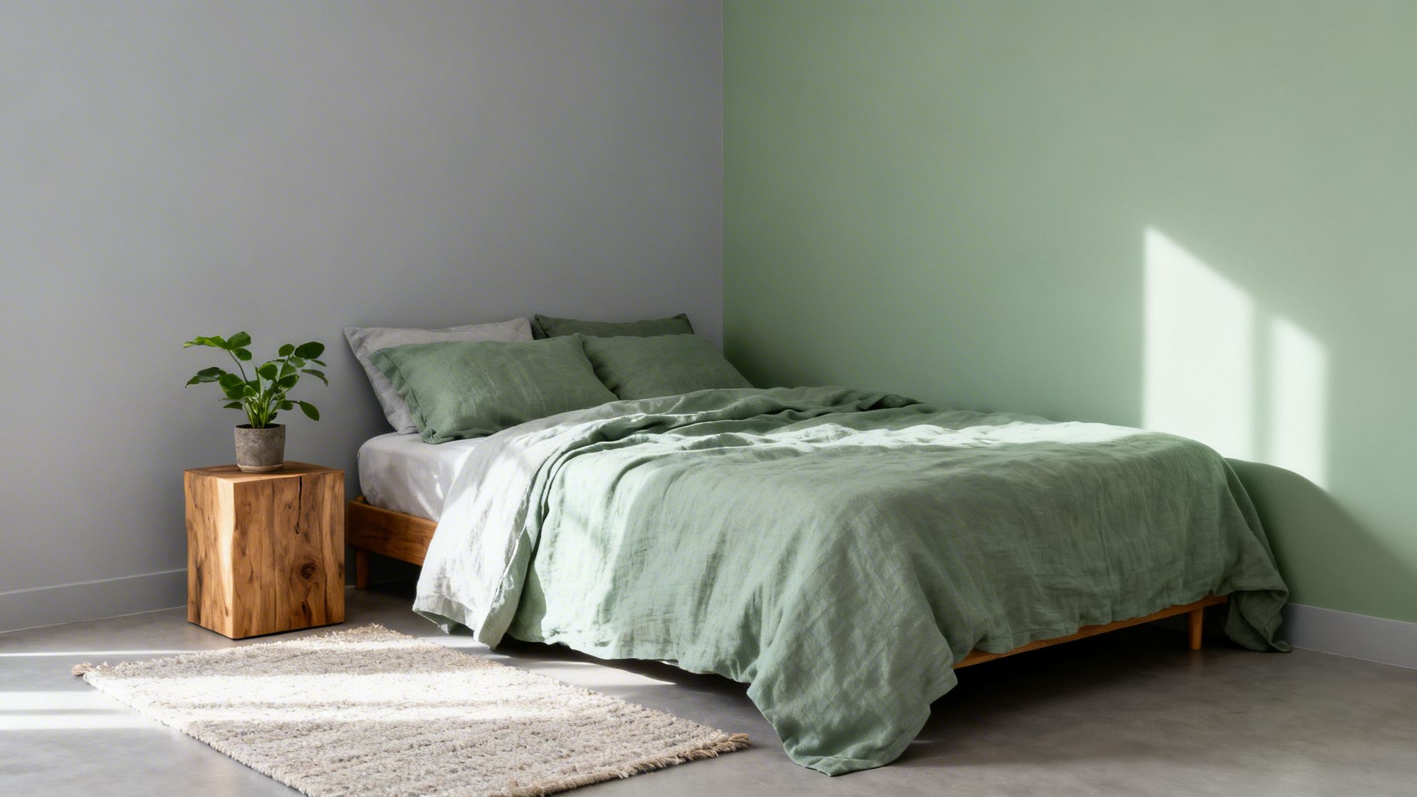
Driven by the wellness design movement, this combination is perfect for creating sanctuaries within the home. It has become a staple for master bedrooms in Fairfield County properties and modern farmhouse-style homes throughout the region. The pairing works because sage green introduces just enough color to add warmth and life to a grey scheme without being overwhelming, resulting in an atmosphere that feels both modern and serene.
Practical Tips for a Grey and Sage Green Palette:
- Balance the Application: Use a neutral grey like Sherwin-Williams' "Agreeable Gray" (SW 7029) on the primary walls and introduce sage green on a feature wall, in cabinetry, or through textiles to create a focal point.
- Emphasize Natural Light: This palette shines in rooms with ample natural light. The sunlight enhances the subtle, earthy tones of sage, making spaces in Westchester County homes feel larger and more connected to the outdoors.
- Incorporate Organic Elements: Complete the biophilic look by adding natural wood elements, such as a light oak vanity or pine shelving. Live plants and natural linens are essential for adding texture and reinforcing the connection to nature.
- Create a Spa-Like Bathroom: Sage green is an excellent choice for bathrooms. Pairing sage tiles or a painted vanity with grey walls can transform a functional space into a calming, spa-like retreat.
7. Grey and Warm Beige/Taupe – Timeless Neutral Warmth
This pairing masterfully blends the cool neutrality of grey with the earthy warmth of beige or taupe, creating a balanced and inviting atmosphere. It’s a sophisticated combination that offers more depth than a simple grey and white scheme but remains firmly in neutral territory. For homeowners and real estate professionals in Fairfield and Westchester counties, this palette is the gold standard for creating broad market appeal and staging homes for sale.
This combination of colors that go with grey is a favorite among home builders for model homes and designers aiming for a high-end, universally pleasing aesthetic. The blend of warm and cool tones provides a subtle complexity that feels both comfortable and curated, making it ideal for open-concept homes in Stamford or family residences in Greenwich that need a cohesive, welcoming feel. It offers warmth without committing to a strong, subjective color.
Practical Tips for a Grey and Beige/Taupe Palette:
- Focus on Greige and Taupe: For the most seamless blend, choose greys with beige undertones (greige) or beiges with grey undertones (taupe). A paint like Benjamin Moore's "Edgecomb Gray" (HC-173) is a perfect example of a color that bridges this gap.
- Layer with Natural Textures: Prevent the neutral palette from feeling flat by incorporating rich textures. Think linen curtains, a wool area rug, light oak flooring, or leather furnishings. These elements add visual interest and physical warmth.
- Use Crisp White for Contrast: To keep the space from looking muddy, use a clean white like Sherwin-Williams' "Pure White" (SW 7005) for ceilings, doors, and trim. This creates sharp definition and brightens the overall look.
- Test in Your Space: This combination is highly sensitive to natural light. A taupe that looks perfect in a south-facing Darien home might appear too brown or drab in a north-facing room in Scarsdale. Always test large samples on multiple walls.
8. Grey and Deep Teal/Jewel Tones – Sophisticated Richness
Pairing a foundational grey with deep jewel tones like teal, emerald, or sapphire creates an elegant, dramatic look full of personality. Grey acts as a stable, grounding neutral that prevents these rich colors from becoming overpowering, resulting in a balanced and confident space. This combination is particularly effective for creating a sense of luxury in master bedrooms, formal dining rooms, or high-end office spaces across Westchester County and Fairfield County.
The inspiration for this moody, atmospheric palette often comes from boutique hotels and contemporary art, where bold color is used to make a deliberate statement. From a feature wall in a Greenwich residence to a modern NYC apartment, this duo communicates a bold and refined aesthetic. It is an excellent choice for anyone looking to move beyond simple neutrals and inject a sense of depth and character into their design.
Practical Tips for a Grey and Jewel Tone Palette:
- Select a Cool Grey: To complement the richness of jewel tones, choose a cool grey with blue or violet undertones. A paint like Sherwin-Williams' "Serious Gray" (SW 6256) provides a perfect backdrop that lets the accent color shine.
- Use as an Accent First: If you're hesitant to commit, start by using a deep teal or emerald on a single feature wall behind a bed or in a formal living room. This creates a strong focal point without overwhelming the space.
- Balance with Light: Deep, saturated colors absorb light. Ensure the room has ample natural or layered artificial lighting to prevent it from feeling too dark. This is crucial for smaller rooms or those with limited windows.
- Consider a Matte Finish: For a truly chic and velvety appearance, use a matte or flat finish on your jewel-tone walls. This minimizes sheen and enhances the color's richness.
9. Grey and Soft Ivory/Cream – Refined Classic Elegance
The combination of grey with soft ivory or cream offers a warmer, more traditional alternative to stark white, creating an atmosphere of refined elegance. This pairing blends the cool neutrality of grey with the gentle warmth of ivory, resulting in a balanced and inviting space. It’s a preferred choice for traditional and transitional homes across Connecticut, where classic style is often blended with modern sensibilities.
This timeless palette is frequently seen in the work of traditional interior designers and is a hallmark of luxury home brands that emphasize enduring style. For formal living rooms, dining rooms, and primary suites in upscale Fairfield County properties, this duo provides a sophisticated backdrop that feels both stately and comfortable. The subtle contrast between grey and cream adds depth without being jarring, perfect for spaces meant for relaxation and entertaining.
Practical Tips for a Grey and Ivory/Cream Palette:
- Balance Undertones: For the most cohesive look, pair a warm grey, like Benjamin Moore's "Balboa Mist" (OC-27), with a creamy off-white, such as Sherwin-Williams' "Dover White" (SW 6385). This ensures the undertones complement each other.
- Strategic Application: A popular application is to use grey on the walls and reserve ivory for the trim, crown molding, and ceiling. This technique highlights architectural details while maintaining a soft, clean look.
- Layer with Rich Textures: Enhance the elegant feel by incorporating materials like dark-stained mahogany, polished brass fixtures, velvet upholstery, and silk drapery.
- Introduce Color with Accents: Use this neutral foundation as a canvas for accent colors. Deep navy, emerald green, or rich burgundy in furnishings, artwork, and textiles can add personality and visual interest to the space.
10. Grey and Crisp White with Subtle Accent Color Pops – Modern Minimalist with Personality
This approach builds on the classic grey and white foundation by introducing strategic, controlled bursts of color. It creates a flexible and modern aesthetic where the neutral backdrop remains timeless, while personality is injected through easily changeable elements. This method is ideal for homeowners and businesses in Fairfield County and Westchester County who want a contemporary look that can evolve without requiring a complete repaint.
Popularized by the minimalist design movement and seen in modern Stamford lofts and NYC apartments, this palette offers the best of both worlds: serene neutrality and vibrant expression. The core space remains calm and open, while accent pieces like artwork, throw pillows, or a statement armchair provide visual interest. It’s a practical strategy for adapting to design trends or seasonal shifts, making it one of the most versatile color combinations that go with grey.
Practical Tips for a Grey and White Palette with Accent Pops:
- Establish a Neutral Base: Use a mid-tone grey like Benjamin Moore's "Coventry Gray" (HC-169) for walls and a clean white such as "Chantilly Lace" (OC-65) for trim and ceilings to create a crisp canvas.
- Choose Replaceable Color Elements: Introduce your accent color through items that are easy to swap out. Think decorative pillows, area rugs, vibrant artwork, or even a single piece of furniture.
- Limit Your Accent Palette: To maintain a cohesive and uncluttered look, stick to two or three accent colors at most. For example, pair a deep navy with a warm ochre.
- Rotate Colors Seasonally: Keep your space feeling fresh by rotating accents. Introduce warm, earthy tones like rust and mustard in the fall and switch to cooler blues and greens in the spring and summer.
Top 10 Colors to Pair with Grey
| Style | 🔄 Implementation Complexity | ⚡ Resource Requirements | ⭐📊 Expected Outcomes | Ideal Use Cases | Key Advantages 💡 |
|---|---|---|---|---|---|
| Grey and White – The Classic Neutral Foundation | Low — straightforward painting and coordination | ⚡ Low — standard paints, minimal staging | ⭐ High — airy, versatile, broad market appeal 📊 dependable resale | All property types; staging and commercial spaces | Timeless, cost-effective, excellent backdrop for accents |
| Grey and Navy Blue – Sophisticated Professional Elegance | Medium — needs careful lighting and placement | ⚡ Moderate — premium navy paint, good lighting | ⭐ High — formal, polished, increases perceived value 📊 strong contrast | Executive offices, upscale homes, feature walls | Sophisticated, hides imperfections, professional look |
| Grey and Warm Gold/Brass Accents – Luxury Contemporary | Medium — metallic finishes require skill | ⚡ Moderate–High — quality metallics, fixtures | ⭐ High — warm luxury and visual drama 📊 upscale finish | Luxury apartments, high-end residential and commercial | Adds warmth to grey; reflective elegance when executed well |
| Grey and Charcoal Black – Bold Modern Drama | Medium–High — lighting and restraint critical | ⚡ Moderate — quality matte paints, lighting plan | ⭐ High — bold focal impact 📊 dramatic modern statement | Lofts, contemporary homes, dramatic commercial spaces | Strong statement; conceals marks; creates focal points |
| Grey and Soft Blush/Mauve – Elegant Feminine Sophistication | Low–Medium — shade selection important | ⚡ Low — paint and soft furnishings | ⭐ Moderate — warm, calming, subtly romantic 📊 good in natural light | Bedrooms, bathrooms, transitional homes | Soft warmth without overpowering; trend-forward when chosen well |
| Grey and Soft Sage Green – Calming Biophilic Design | Low–Medium — undertone matching matters | ⚡ Low — paint, plants, natural materials | ⭐ High for wellness — calming, nature-connected 📊 promotes relaxation | Bedrooms, spas, wellness-focused residences | Biophilic appeal; pairs well with wood and plants |
| Grey and Warm Beige/Taupe – Timeless Neutral Warmth | Low — easy to implement broadly | ⚡ Low — standard paints, staging-friendly | ⭐ High — universally appealing, move-in ready 📊 strong resale suitability | Model homes, staged properties, broad-market listings | Safe, versatile, maximizes buyer imagination |
| Grey and Deep Teal/Jewel Tones – Sophisticated Richness | Medium — balance boldness with light | ⚡ Moderate — premium pigments, accent pieces | ⭐ High — rich, memorable, designer-forward 📊 creates luxe focal areas | Upscale residences, feature walls, executive suites | Distinctive and luxurious; hides imperfections well |
| Grey and Soft Ivory/Cream – Refined Classic Elegance | Low — classic and forgiving pairing | ⚡ Low — common paints, simple coordination | ⭐ High — refined and enduring 📊 versatile across styles | Traditional/transitional homes, historic properties | Timeless elegance; complements both modern and classic decor |
| Grey and Crisp White + Accent Pops – Modern Minimalist with Personality | Low–Medium — requires thoughtful styling | ⚡ Low — interchangeable decor and accessories | ⭐ High — flexible, modern backdrop 📊 easy updates without repainting | Rentals, modern homes, frequently updated spaces | Highly adaptable; refresh via décor; maximizes light |
Bring Your Perfect Grey Palette to Life with Professional Precision
Grey is far more than a simple neutral; it's a dynamic and foundational color that serves as the perfect canvas for thoughtful design. As we've explored, the true potential of grey is unlocked when paired with the right companion colors. From the classic, clean look of grey and crisp white to the bold drama of charcoal or the calming, nature-inspired feel of sage green, the possibilities are extensive and exciting. Your choice of grey, whether it carries cool blue undertones or warm greige notes, dictates the entire mood of a space.
The key takeaway is that success lies in the details. Understanding the undertone of your chosen grey is the first critical step. A cool grey like Benjamin Moore’s “Coventry Gray” (HC-169) behaves very differently from a warm, earthy grey like Sherwin-Williams’ “Repose Gray” (SW 7015). This single decision influences whether you lean into the sophisticated depth of navy blue or the inviting warmth of gold and brass accents. For homeowners and designers in Connecticut and New York, where historic architecture meets modern sensibilities, these color pairings can bridge styles, update classic homes, and add personality to new constructions.
Mastering the Application for a Flawless Finish
Beyond just selecting colors that go with grey, the execution is what separates an average result from a truly professional one. The final appearance is a product of several factors:
- Light and Sheen: The same grey and teal combination can look dramatically different depending on the natural light in a room and the paint sheen you select. A matte finish will absorb light and hide imperfections, while a satin or semi-gloss finish will reflect light and highlight architectural details.
- Surface Preparation: A high-end finish is impossible without meticulous preparation. Proper sanding, priming, and caulking ensure that the final coats of paint are smooth, durable, and free of flaws, allowing the true color to shine.
- Application Technique: The skill of the painter directly impacts the outcome. Professional application avoids common pitfalls like roller marks, uneven coverage, and messy trim lines, ensuring the palette you envisioned is the palette you see on your walls.
Ultimately, bringing a sophisticated color palette to life is a craft. It requires a deep understanding of how colors interact with light, texture, and each other. The journey from a paint chip to a beautifully finished room is where expertise makes all the difference, ensuring your vision is realized with precision and lasting quality.
Choosing the perfect colors that go with grey is the first step; expert application is what ensures a stunning, lasting result. At CP Painting Company, we specialize in transforming design concepts into flawless reality for homes and businesses across Fairfield and Westchester Counties. For a complimentary consultation to discuss your project, contact the expert team at CP Painting Company.
Produced via Outrank app


