
A sunroom is more than just a room; it's a sanctuary flooded with natural light, a bridge between your home and the outdoors. Selecting the right sunroom paint colors is critical to managing this unique atmosphere. The wrong shade can make a bright space feel sterile and cold, or a cozy nook feel small and dim. This guide provides specific, actionable advice for homeowners, designers, and contractors across Connecticut and New York, addressing the distinct architectural styles and lighting conditions found from Stamford, CT, to Westchester County, NY.
We will explore eight professionally curated paint color palettes designed to perfect your sunroom. This is not just a list of colors; it’s a practical roadmap. You'll learn how to choose palettes based on your sunroom's orientation (north, south, east, or west-facing), get specific recommendations for paint finishes and sheens for trim and ceilings, and discover how to coordinate colors with your existing furniture and flooring. Prepare to transform your sun-filled space from a simple addition into the true heart of your home.
1. Soft Warm White & Cream Palette: The Timeless Choice
A soft, warm white and cream palette stands as a classic foundation for sunroom paint colors, prized for its ability to maximize light reflection without feeling cold or clinical. This approach involves using off-whites and creams with subtle warm undertones (yellow, peach, or beige) to create a bright, inviting, and expansive atmosphere. Unlike stark, pure whites that can appear harsh in intense sunlight, these softer shades absorb and diffuse light gently, producing a welcoming glow that feels connected to the natural world just outside the windows.
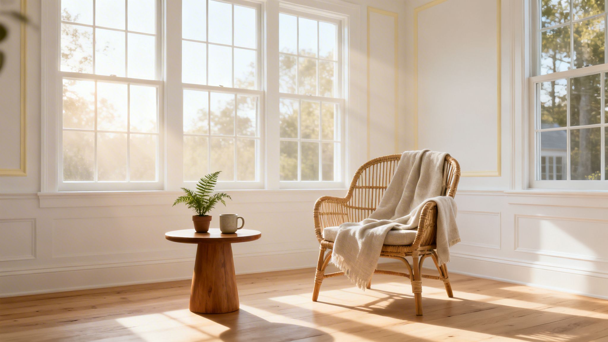
This palette is particularly effective in Connecticut and Westchester County homes where sunrooms often bridge traditional architecture with modern living. The warmth in these whites complements the historic character found in many Stamford and Fairfield properties while providing a clean backdrop for contemporary furniture and decor. It’s an ideal choice for north-facing sunrooms that receive less direct sunlight, as the warm undertones prevent the space from feeling shadowy or drab.
How to Implement This Palette
Achieving a polished look with a warm white and cream palette requires attention to detail. The key is layering tones and textures to build visual interest and avoid a flat, one-dimensional appearance.
- Wall Color Selection: Choose a primary wall color with discernible warmth. Popular choices include Benjamin Moore’s Swiss Coffee (OC-45), known for its creamy, soft glow, or Sherwin-Williams’ Alabaster (SW 7008), which has a more neutral, balanced warmth.
- Trim and Ceiling Strategy: Paint the trim and ceiling in a slightly crisper or lighter shade of white to create subtle contrast and make the walls appear richer. Using a semi-gloss finish on trim, window casings, and doors will catch the light and highlight architectural details.
- Create Depth: To add depth, consider painting the wall with the most windows in a slightly deeper cream or a soft greige. This technique draws the eye toward the view and adds a layer of complexity to the design.
Expert Insight: Always test your paint samples on different walls within the sunroom. Observe how the color changes throughout the day as the natural light shifts. A warm white that looks perfect in the morning sun might read too yellow in the late afternoon. This is a critical step for getting your sunroom paint colors just right.
2. Soft Sage Green & Neutral Complement
A soft sage green paired with a neutral complement like greige or taupe brings the tranquility of nature indoors, establishing a direct connection to the surrounding landscape. This biophilic design approach uses muted greens with gray undertones to create a serene, restorative atmosphere perfect for a sunroom. The sage provides a subtle hint of color that is calming and organic, while the neutral pairing adds warmth and sophistication, preventing the green from feeling overwhelming.
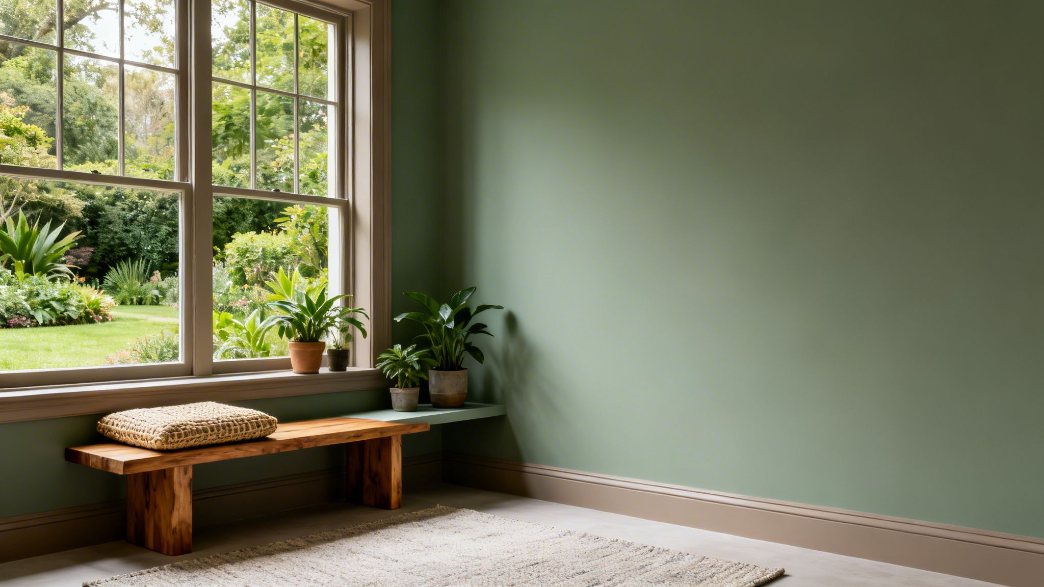
This particular palette is highly effective in Fairfield and Hartford County homes where sunrooms often overlook lush gardens or wooded lots. It bridges the interior and exterior worlds, making the room feel like a natural extension of the outdoors. The combination of green and a warm neutral also suits the Scandinavian and modern farmhouse styles popular in Westchester County and Stamford, CT, especially when paired with natural wood tones and textiles. It’s an ideal choice for sunrooms intended as reading nooks, meditation spaces, or quiet retreats.
How to Implement This Palette
Success with this palette lies in finding the right balance between the green and its neutral partner, ensuring the colors work together to create a cohesive and peaceful environment.
- Wall Color Selection: Choose a muted sage green with balanced gray undertones to avoid it appearing too minty or yellowish in bright light. Benjamin Moore’s October Mist (1495) or Sherwin-Williams’ Sea Salt (SW 6204) are excellent starting points for these sophisticated sunroom paint colors.
- Trim and Accent Strategy: For a modern and layered look, paint the trim in a soft, warm greige like Sherwin-Williams’ Accessible Beige (SW 7036). This creates a gentle contrast that is more complex than standard white trim. Alternatively, use the sage on an accent wall and apply the greige to the remaining three walls.
- Create Harmony: Coordinate the paint with natural materials. This color scheme pairs beautifully with warm wood tones (like oak or walnut), rattan furniture, and linen textiles, reinforcing the connection to nature.
Expert Insight: Sage green is highly sensitive to light. A color that looks perfectly gray-green in the morning might take on a blue or yellow cast in the afternoon sun. Always test large paint swatches on multiple walls and observe them throughout the day before committing. This is crucial for achieving the intended serene and earthy feel.
3. Soft Blue & White Nautical Palette
A soft blue and white nautical palette brings a fresh, coastal-inspired feeling to a sunroom, creating a serene and airy atmosphere. This combination uses pale, muted blue walls paired with crisp white trim and accents to evoke the calmness of the sea and sky. The soft blue tones promote relaxation and mental clarity, while the clean white details keep the space feeling bright, open, and tied to the abundant natural light.
This approach is particularly well-suited for Connecticut and Westchester County homes, where the coastal New England aesthetic is a significant part of the region's design identity. In Fairfield County homes with water views or Stamford properties with nautical inspiration, this palette connects the interior directly to the surrounding environment. It’s an excellent choice for sunrooms that get a lot of direct sunlight, as the cool blue helps balance the intensity and prevent the room from feeling overheated.
How to Implement This Palette
To create a sophisticated coastal look, the focus should be on subtlety and balance, avoiding overt nautical clichés. The goal is a modern, refined space that feels breezy and calm.
- Wall Color Selection: Opt for a muted, sophisticated blue with gray or green undertones instead of a bright primary blue. Benjamin Moore’s Palladian Blue (HC-144) is a celebrated choice for its airy, spa-like quality, while Sherwin-Williams’ Sea Salt (SW 6204) offers a versatile green-blue that changes beautifully with the light.
- Trim and Ceiling Strategy: Paint the trim, ceiling, and interior doors in a crisp, clean white to provide sharp contrast and make the blue walls pop. A semi-gloss finish on the trim will reflect light and draw attention to the room's architectural lines, enhancing the bright, clean aesthetic.
- Create Depth: For an immersive effect, consider painting the ceiling a very pale shade of the wall color to mimic the open sky. Incorporating natural wood tones through furniture or flooring will add warmth and prevent the cool palette from feeling sterile.
Expert Insight: Texture is your best friend with this palette. Instead of using bold, thematic patterns, introduce texture through jute or sisal rugs, linen curtains, and rattan furniture. This approach adds a layer of nautical-inspired interest that feels organic and modern, keeping the focus on the relaxing quality of your sunroom paint colors.
4. Warm Terracotta & Cream Southwestern Palette
A warm terracotta and cream palette brings the sun-baked earthiness of Mediterranean or Southwestern design into the home, creating a sanctuary of warmth and comfort. This combination pairs muted, sophisticated rust tones with soft cream accents to produce a cozy yet refined atmosphere. The rich terracotta base absorbs and radiates warm natural light, making it a superb choice for sunrooms intended for evening relaxation or use during cooler months.
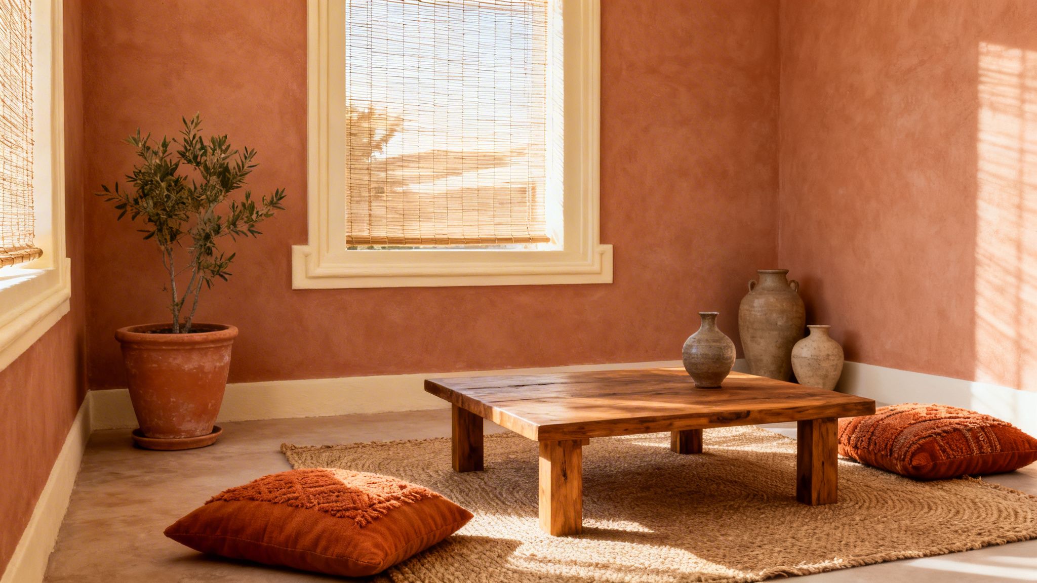
This particular palette is gaining traction across Connecticut, from Fairfield County homes with Mediterranean-inspired architecture to rustic Litchfield County renovations. Its ability to add depth and personality makes it a standout among sunroom paint colors. The earthy tones connect the indoor space to outdoor gardens and natural landscapes, offering a welcoming retreat that feels both grounded and inviting. The warmth it provides is especially valuable in creating a year-round haven.
How to Implement This Palette
Successfully executing this look depends on selecting the right shade of terracotta and balancing it with complementary textures and tones. The goal is to create warmth without overwhelming the space.
- Wall Color Selection: Choose a muted, sophisticated terracotta rather than a bright, loud orange. Benjamin Moore’s Caliente (AF-290) offers a charismatic red, while Sherwin-Williams’ Cavern Clay (SW 7701) provides a warm, earthy hue reminiscent of desert landscapes.
- Trim and Ceiling Strategy: Pair the terracotta walls with cream or a warm off-white on the trim, window casings, and ceiling. This creates a clean, crisp contrast that prevents the deep wall color from feeling too heavy and helps reflect light throughout the room.
- Create Depth: Incorporate natural materials to enhance the earthy aesthetic. Furniture made from natural wood, accents like woven baskets, and textiles with organic textures will complement the wall color and add layers of visual interest.
Expert Insight: Terracotta is a complex color that can shift dramatically with changing light. A shade that appears warm and inviting in the morning might look deep and intense in the late afternoon. Always test large swatches on multiple walls and observe them throughout the day before committing. This step is essential for achieving the right mood.
5. Pale Yellow & Warm White Sunshine Palette
A pale yellow and warm white palette brings a dose of cheerful optimism to a sunroom, creating an energy-boosting atmosphere that feels both refined and welcoming. This combination uses soft, barely-there yellows with warm undertones paired with creamy whites to amplify the psychological benefits of natural light. The subtle yellow casts a sunrise-like quality that feels perpetually bright, making it an excellent choice for sunroom paint colors intended to counteract the darker, colder months.
This palette is especially effective in residential properties throughout Fairfield and Hartford County, where sunrooms are often designed as morning breakfast areas or spaces to promote wellness. In east-facing sunrooms, a pale yellow captures the morning light beautifully, sustaining a warm, sunny feeling long after the sun has moved. It offers a sophisticated alternative to bolder yellows, providing warmth without becoming overwhelming.
How to Implement This Palette
The success of this palette hinges on choosing the right shades of yellow and white to create a soft, cohesive look rather than a high-contrast, jarring one. It’s about creating an ambient glow.
- Wall Color Selection: Opt for a very pale, muted yellow with distinct warm undertones. Benjamin Moore’s Hawthorne Yellow (HC-4) offers a classic, buttery warmth, while Sherwin-Williams’ Sunbeam Yellow (SW 6675) provides a gentle, optimistic feel. For a more subdued approach, consider an accent wall if you're concerned about saturation.
- Trim and Ceiling Strategy: Pair the yellow walls with a warm white trim and ceiling to avoid stark, hard lines. This creates a seamless transition and makes the space feel more open and integrated. The goal is to soften the edges where walls meet trim.
- Ground the Palette: Use natural wood accents in furniture and flooring to ground the airy palette. The organic textures of oak, maple, or bamboo complement the warm tones and prevent the room from feeling too whimsical.
Expert Insight: Always test your yellow paint samples in the sunroom during both morning and afternoon light. A pale yellow that looks perfect at sunrise might appear too intense or have a greenish cast in the cooler light of late afternoon. This is a critical step for achieving a consistent, welcoming ambiance throughout the day.
6. Soft Greige & Warm Taupe: The Sophisticated Neutral
A palette of soft greige and warm taupe offers a contemporary yet enduring choice for sunroom paint colors, merging the modern appeal of gray with the inviting warmth of beige. This sophisticated combination has become a favorite among designers in Connecticut and Westchester County for its versatility. Greige provides a chic, neutral backdrop that feels current without being overtly trendy, ensuring the design remains timeless. It strikes an ideal balance, creating a space that is both calming and full of character.
This color scheme is particularly effective in transitional and contemporary homes, from Stamford to Hartford County. It complements the natural materials common in modern residential properties, especially the warm hardwood flooring prevalent in many Connecticut homes. The subtle warmth in greige and taupe prevents the sunroom from feeling sterile, even with abundant natural light, making it a perfect solution for creating an elegant, comfortable retreat that connects seamlessly with the outdoors.
How to Implement This Palette
Successfully executing a greige and taupe palette involves selecting the right undertones and layering textures to build a rich, cohesive environment. The goal is to create a look that feels intentionally designed and harmonious.
- Wall Color Selection: Choose a primary greige with noticeable warm undertones to avoid a cool, sterile look. Benjamin Moore’s Revere Pewter (HC-172) is a classic choice, while Sherwin-Williams’ Agreeable Gray (SW 7029) offers a lighter, more versatile option.
- Trim and Accent Strategy: For a clean, defined look, pair greige walls with crisp, warm white trim like Benjamin Moore's Ballet White (OC-9). To introduce dramatic contrast, consider using a deep, earthy tone like Sherwin-Williams’ Urbane Bronze (SW 7048) on an accent wall, interior door, or window mullions.
- Layer with Texture: Enhance the neutral walls by incorporating a variety of textures. Think natural wood furniture, linen curtains, wool rugs, and woven baskets. These elements add depth and prevent the color scheme from feeling flat.
Expert Insight: The undertones in greige are highly susceptible to the quality of light. Always test large paint swatches in your sunroom. A greige that looks perfect in a west-facing room might pull unwanted cool or green tones in a north-facing space. Observe the color in morning, noon, and evening light before committing.
7. Deep Charcoal & Cream Modern Contrast Palette
A deep charcoal and cream palette introduces a bold, contemporary edge to sunroom design, creating dramatic visual interest through high contrast. This sophisticated approach pairs dark, moody walls with crisp white or cream trim and ceilings, a combination gaining traction in modern residential properties across Westchester County and Stamford, CT. The dark walls absorb light to create a cozy, enveloping feel, while the bright accents prevent the space from feeling heavy or small, reflecting light and defining the room's architecture.
This palette is particularly striking in sunrooms with abundant natural light from south or west-facing windows, as the intense sun prevents the dark colors from overpowering the room. It’s an ideal choice for design-forward homeowners in Fairfield County looking to transform their sunroom from a casual extension into a distinct, high-impact design statement. The urban sensibility of this look feels right at home in properties influenced by NYC design trends.
How to Implement This Palette
Balancing this high-contrast palette is key to its success. The goal is a dramatic but liveable space, not a dark, cave-like room. Careful selection of finishes and furnishings is essential.
- Wall Color Selection: Choose a deep, complex charcoal or near-black. Benjamin Moore’s Kendall Charcoal (HC-166) offers a rich, versatile gray, while Sherwin-Williams’ Iron Ore (SW 7069) provides a softer, deeper charcoal tone for a bold statement.
- Trim and Ceiling Strategy: This is the most critical element for balance. Paint all trim, window casings, and the ceiling in a crisp, clean white or a very light cream. A semi-gloss finish on the trim will create a sharp, reflective line against the matte or eggshell walls.
- Furniture and Decor: Furnish the room with light-colored pieces. A sofa in a light gray, beige, or white fabric, paired with light wood or white furniture, will pop against the dark walls. Use a large, light-colored area rug to anchor the seating area and further brighten the floor plane.
Expert Insight: Before committing to painting all four walls, consider an accent wall. Painting only the main feature wall in a deep charcoal can deliver the desired drama without overwhelming the space. Also, remember that your lighting plan is crucial; incorporate warm accent lighting and statement fixtures to ensure the room feels inviting after sunset.
8. Soft Lavender & Cream Calming Palette
A soft lavender and cream palette introduces an elegant, soothing quality to sunroom paint colors, creating a spa-like, meditative atmosphere. This sophisticated combination is increasingly popular among Connecticut homeowners who envision their sunrooms as personal retreats and wellness spaces. Muted lavenders, long associated with relaxation and stress reduction, are paired with warm cream accents to foster a serene environment ideal for yoga, reading, or quiet contemplation.
This palette is a perfect match for wellness-focused home renovations in Fairfield County and properties in Stamford designed to include meditation or yoga rooms. The calming nature of soft lavender appeals to homeowners seeking to integrate spa-like elements into their daily lives, providing a gentle departure from traditional neutrals without overwhelming the space. The warmth of the cream ensures the room remains inviting and connected to the natural light, preventing the cooler lavender from feeling distant or stark.
How to Implement This Palette
Successfully creating a tranquil lavender and cream sunroom depends on selecting the right shades and balancing them with texture and warmth. The goal is a subtle, restorative feel, not a vibrant purple room.
- Wall Color Selection: Choose a very soft, muted lavender with gray or dusty undertones. Benjamin Moore’s Violet Veil (1408) offers a delicate touch, while Sherwin-Williams’ Potentially Purple (SW 6552) provides a subtle, ethereal hint of color.
- Trim and Ceiling Strategy: Pair lavender walls with warm cream or soft white trim to prevent the room from feeling too cool. A crisp white can create a stark contrast, so opt for shades with yellow or beige undertones to maintain a soft, cohesive look.
- Incorporate Natural Materials: Ground the palette by adding natural materials like light-toned wood flooring, stone accents, and plenty of green plants. These elements connect the ethereal lavender to the earth, enhancing the room’s restorative quality.
- Consider an Accent Wall: For a more subtle approach, consider painting just a single accent wall in lavender and keeping the remaining walls a warm cream. This adds a point of interest without fully committing the entire space to the color.
Expert Insight: Test your lavender samples extensively, paying close attention to the afternoon light when blue and purple tones can become more pronounced. What appears as a soft, grayish lavender in the morning might look much more purple in different lighting conditions. This is a critical step for choosing sunroom paint colors that maintain their intended subtlety all day.
Sunroom Paint Palette Comparison — 8 Options
| Palette | Implementation Complexity 🔄 | Resource Requirements ⚡ | Expected Outcomes ⭐ 📊 | Ideal Use Cases 💡 | Key Advantages ⭐ |
|---|---|---|---|---|---|
| Soft Warm White & Cream Palette | Low 🔄 | Low–Moderate ⚡⚡ (premium paint recommended) | ⭐⭐⭐⭐ Bright, airy; maximizes perceived space and light | Resale-focused CT sunrooms; transition spaces | Maximizes light reflection; neutral backdrop; broad resale appeal |
| Soft Sage Green & Neutral Complement | Medium 🔄🔄 (careful undertone matching) | Moderate ⚡⚡ (sample testing, warm woods) | ⭐⭐⭐ Calming, biophilic; complements plants and views | Meditation/reading sunrooms; garden-facing rooms | Biophilic harmony; calming atmosphere; pairs well with natural materials |
| Soft Blue & White Nautical Palette | Low–Medium 🔄🔄 | Low–Moderate ⚡⚡ (muted blue + white trim) | ⭐⭐⭐ Airy, coastal calm; reduces stress and opens space | Coastal or water-view sunrooms; family-friendly bright spaces | Light, familiar coastal aesthetic; promotes relaxation |
| Warm Terracotta & Cream Southwestern Palette | Medium 🔄🔄 (tone selection critical) | Moderate–High ⚡⚡⚡ (testing; warm lighting) | ⭐⭐⭐ Warm, cozy; absorbs and softens bright light | South/west-facing sunrooms; evening or cooler-month use | Creates warmth and hospitality; earthy, grounded aesthetic |
| Pale Yellow & Warm White Sunshine Palette | Medium 🔄🔄 (avoid saturation/green cast) | Low–Moderate ⚡⚡ (sample testing) | ⭐⭐⭐ Luminous, mood-boosting; enhances morning light | East-facing breakfast/ morning sunrooms; seasonal brightening | Amplifies light; uplifting and energy-enhancing |
| Soft Greige & Warm Taupe Sophisticated Neutral | Medium 🔄🔄 (undertone balance) | Moderate ⚡⚡ (premium options preferred) | ⭐⭐⭐⭐ Versatile, contemporary backdrop; consistent in varied light | Designer renovations; resale-oriented modern/transitional homes | Highly versatile; contemporary yet timeless; strong resale value |
| Deep Charcoal & Cream Modern Contrast Palette | High 🔄🔄🔄 (lighting and balance critical) | High ⚡⚡⚡ (quality paint, lighting design) | ⭐⭐⭐ Dramatic, sophisticated; can reduce perceived size if underlit | Large, very sunlit sunrooms; design-forward statement spaces | Bold visual impact; highlights architectural details; hides marks |
| Soft Lavender & Cream Calming Palette | Medium 🔄🔄 (undertone caution) | Moderate ⚡⚡ (sample testing; warm lighting) | ⭐⭐⭐ Calming, spa-like; supports relaxation and wellness | Wellness retreats, yoga/meditation sunrooms, quiet reading nooks | Promotes relaxation; upscale spa aesthetic; soft, curated feel |
Bringing Your Vision to Life with Professional Precision
Choosing the perfect sunroom paint colors is a defining moment in your design process. You've explored how a soft sage green can connect your space to the garden, how a deep charcoal can create a bold, modern frame for the outdoors, and how a classic soft white can maximize the feeling of light and airiness. Each palette, from the sun-drenched warmth of pale yellow to the calming retreat of soft lavender, offers a distinct path to creating your ideal sanctuary. The journey, however, doesn't end with a paint chip.
The true success of your project lies in the execution. A sunroom is a unique architectural space, defined by an abundance of natural light that changes dramatically from sunrise to sunset. This constant, direct exposure makes the technical aspects of painting more critical than in any other room of your home.
The Decisive Difference: From Good to Flawless
Achieving a professional-grade finish involves mastering several key elements that go far beyond simply applying color to a wall:
- Surface Preparation is Paramount: In a room where sunlight highlights every imperfection, meticulous prep is non-negotiable. This means properly cleaning surfaces to remove dust and residue, filling any cracks or holes, and sanding for a completely smooth canvas. Skipping these steps can lead to a finish that looks uneven and unprofessional under intense light.
- Sheen Selection Matters More Than Ever: The finish you choose directly impacts how light behaves. An eggshell or satin finish on walls provides a soft, durable glow without the harsh glare of a higher gloss. For trim, baseboards, and window casings, a semi-gloss finish is ideal. It not only provides a crisp, defining contrast but also offers superior durability against scuffs, moisture, and the wear that comes with operating windows and doors.
- Durability Against the Elements: Sunroom paint must withstand a difficult environment. Intense, daily UV exposure can cause inferior paints to fade and lose their vibrancy in just a few years. Furthermore, temperature fluctuations between seasons can cause paint to expand and contract, leading to cracking and peeling. Using high-quality, fade-resistant paint formulated for such conditions is essential for a lasting, beautiful result.
Key Takeaway: The ultimate character of your sunroom is not just determined by the color you choose, but by the quality of the application. The precision of the cut-in lines, the uniformity of the finish, and the durability of the products used are what elevate a concept into a breathtaking reality.
For homeowners and design professionals in areas like Stamford, Greenwich, and across Fairfield and Westchester Counties, these considerations are especially important. The distinct four-season climate demands a painting solution that is as resilient as it is beautiful. This is where professional expertise becomes invaluable, ensuring your investment is protected and your vision is perfectly realized.
Ready to turn your chosen sunroom paint colors into a stunning, long-lasting reality? The team at CP Painting Company specializes in high-quality interior painting for discerning clients throughout Connecticut and New York. We understand the unique challenges of sunrooms and use only premium materials and meticulous techniques to deliver a flawless finish. Contact CP Painting Company today for a professional consultation and let us help you create the light-filled retreat you've always imagined.


