
For years, the conversation about trim paint colors started and ended with one word: white. But today, homeowners are realizing that trim is far more than just a frame for your walls—it’s a powerful design tool in its own right.
From warm, creamy off-whites that bring a soft glow to a room, to dramatic charcoals and navies that inject serious character, the right choice is all about context. It depends on your wall color, the light your home gets, and even the architectural story your house tells.
Rethinking Trim Beyond Basic White
For decades, we were all taught that crisp white trim was the gold standard. It was safe, clean, and you didn't have to think too hard about it. But treating your trim as an afterthought is a huge missed opportunity. Your baseboards, window casings, and crown molding can do so much more than just sit there.
When you move beyond builder-grade white, you unlock a new layer of design. A strategic trim color can completely shift a room’s personality, create clever optical illusions to make a space feel bigger or cozier, and tie a whole design scheme together. It's about seeing your trim as a key player, not just a backup singer.
The Impact of Thoughtful Trim Colors
Think about the difference between a classic Fairfield County colonial and a modern apartment in NYC. In that historic home, a soft, creamy trim feels right, honoring its heritage. But in a sleek, modern apartment, a bold, dark trim can create architectural punch where there wasn't any before. The goal is always to find a color that feels harmonious with your walls, furniture, and the unique light in your space.
This means we have to explore a much wider palette:
- Warm Neutrals: Colors like beige, greige, and mushroom create a welcoming vibe. They feel more layered and intentional than a stark white ever could.
- Bold Darks: We're seeing more clients embrace deep charcoals, rich blacks, and even dark greens on trim. It grounds a room, can make ceilings feel higher, and adds an instant dose of sophistication.
- Monochromatic Tones: Painting your trim just a few shades lighter or darker than the walls is a designer's secret. It creates a seamless, elegant look that makes any space feel larger and more cohesive.
The real power of trim color is its ability to direct the eye and control a room's mood. High-contrast trim demands attention, while a blended, tonal trim whispers elegance. Your choice sets the stage for everything else in the room.
Ultimately, rethinking your trim is the first step toward a more curated and personal home. Instead of defaulting to white, take a moment to consider how a different hue could better reflect your style and elevate your home's best features. We've even created custom colors for clients wanting something truly unique, like this perfect custom beige for a recent project.

Coordinating Trim Colors With Your Walls and Architecture
Choosing the right trim color isn't about following some strict design rulebook. It's about feel. What vibe are you going for? A calm, cohesive space, or one with crisp, defined lines? The answer lies in your home’s bones—its architectural style, the color of your flooring, and how the light hits the walls. A historic Colonial in Litchfield County tells a very different story than a modern NYC apartment, and the right trim helps tell it.
The goal is always a palette that looks and feels intentional. Generally, you have three paths you can take: a subtle monochromatic look, a classic high-contrast pairing, or a bold, dramatic statement. Each one offers a unique way to highlight your home’s best features.
Creating a Subtle Monochromatic Flow
One of the most elegant moves is to pick a trim color that’s just a few shades lighter or darker than your wall color. This creates a soft, seamless look that can make a room feel larger and more unified. It's a sophisticated technique that adds depth without screaming for attention.
Picture a room with soft, hazy blue walls. By painting the trim a slightly deeper, dustier version of that same blue, you get this beautiful, layered effect. We find this works perfectly for creating serene bedrooms or calming living rooms where you want the focus to be on furniture and decor, not the trim itself.
Achieving Classic High Contrast
This is the timeless combination most people picture: a colored wall paired with a crisp white or off-white trim. It's popular for a reason—it just works. This approach really defines the architectural details, making crown molding pop and window casings stand out like sharp, clean picture frames.
For instance, a rich navy blue wall next to a bright, clean white trim has a classic, almost nautical feel. In a Stamford, CT home with great architectural character, this high-contrast look is a fantastic way to celebrate the quality craftsmanship of the space.
This decision tree can help you map out which strategy best fits your design goals, whether you're trying to define the room's character, play with perception, or unify your home's overall look.
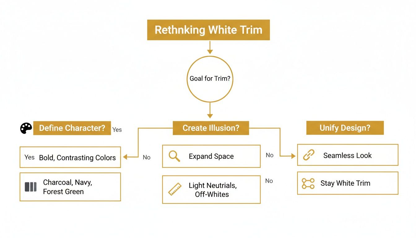
As you can see, your trim choice is a foundational design decision that really sets the tone for the entire room.
Making a Bold Statement With Color
If you’re feeling a bit more daring, using a dark or colorful trim is a fantastic way to create drama and inject personality. A deep charcoal trim against a smoky jade wall, for example, adds instant mood and sophistication. It’s an excellent choice for making a statement in a dining room, library, or home office.
You can also use your trim to introduce an unexpected accent color. Don't be afraid to experiment here. A warm, earthy khaki trim can beautifully balance a room with cool gray walls, proving that opposites can absolutely attract to create a cozy, inviting atmosphere. This trend toward warmer, nature-inspired trim colors is something we're seeing more and more.
We’re seeing a major shift in the $40 billion global paint industry. Demand for neutral and khaki-toned trim paints has jumped by 35% in the last five years. Sherwin-Williams even named Universal Khaki its 2026 Color of the Year—a sophisticated beige-khaki that’s perfect for modern homes across Connecticut and New York. It speaks to a growing desire for timeless, stable colors. You can read more on this trend and what it means for upcoming palettes by exploring the latest 2026 paint color forecasts on thesiliconreview.com.
Looking ahead, we're seeing some exciting trends emerge that blend classic style with a fresh, modern sensibility, especially for homes in our area.
2026 Trim Color Trends and Pairings for CT/NY Homes
Here's a quick look at the top trim colors we're seeing requested for 2026 and how to pair them for a look that feels both current and timeless in a Connecticut or New York home.
| Trim Color Trend | Description | Best Paired With (Wall Colors) | Ideal For |
|---|---|---|---|
| Warm Off-Whites | Creamy, soft whites with yellow or pink undertones. | Earthy greens, warm grays, terracotta, deep blues. | Creating a cozy, inviting feel in historic or traditional homes. |
| "Greige" Tones | A versatile blend of gray and beige. | Muted pastels, mushroom, navy, soft black. | Modern farmhouses and transitional spaces needing a neutral anchor. |
| Earthy Khakis | A sophisticated, nature-inspired beige-green. | Creamy whites, charcoal gray, smoky jade green. | Contemporary and minimalist homes looking for warmth and stability. |
| Deep Charcoals | A bold, almost-black gray. | Crisp whites, light grays, jewel tones (emerald, sapphire). | Adding drama and definition to dining rooms, offices, or accent walls. |
These trends show a clear move away from stark, cold whites toward trim colors with more depth and personality. They work beautifully with the natural light and architectural styles common throughout our region, offering a sophisticated update that still feels classic.
How to Select the Right Undertones and Sheen
Choosing a trim color goes way beyond just picking "white." The real magic is in the details—specifically, the undertones and the sheen. Get these two things right, and your room feels cohesive and polished. Get them wrong, and something will just feel off, even if you can’t quite put your finger on why.
Undertones are the subtle hints of color hiding just beneath the surface. They’re what make one white feel warm and inviting, while another feels crisp and modern. Nailing this is the secret to creating harmony between your trim and your walls.
Reading the Room’s Undertones
First things first: you have to identify the undertones already present in your space. Take a good look at your wall color, flooring, and even big furniture pieces like your sofa or area rug. Do they lean warm, with hints of yellow, red, or cream? Or are they cool, showing notes of blue, green, or pure gray?
For instance, a popular greige wall might seem perfectly neutral at first. But hold a pure white paint chip next to it, and you’ll suddenly see its subtle green or violet undertones pop. In a New Haven County home with that cool, often grayish northern light, a trim with a yellow undertone can look dingy. A trim with a crisp blue undertone, on the other hand, will feel clean and intentional.
Always, always compare your trim sample directly against your wall color to see how they play together.
A common mistake we see is choosing a trim color in a vacuum. A beautiful, creamy off-white might look fantastic on its own, but pair it with a cool gray wall, and its yellow undertones can clash, making both colors look muddy. The goal is harmony.
Understanding how these subtle colors interact is everything. If you want to see this process in action, you can explore how a custom beige was created to complement existing elements. Your trim color should elevate your walls, not fight with them.
Decoding Paint Sheen for Trim
Once you’ve landed on the perfect color, your next decision is the sheen—basically, how shiny the paint is. For trim, this is both a style choice and a practical one. The sheen you pick affects everything from durability and washability to how much it highlights (or hides) imperfections.
Paint sheen ranges from completely flat to a mirror-like shine. Here’s the breakdown:
- Flat/Matte: No shine at all. It’s great for hiding bumps on a wall, but it’s simply not durable or washable enough for trim. We never recommend it.
- Eggshell/Satin: This is a low-luster, almost velvety finish. Satin is a step up in durability from eggshell and can be a nice choice for window casings in low-traffic rooms where you want a softer look.
- Semi-Gloss: This is the undisputed industry standard for trim, and for good reason. It has a noticeable shine that makes architectural details pop, and its hard finish is highly durable and easy to clean. It's our go-to for baseboards, door casings, and any trim that gets a lot of wear and tear.
- High-Gloss: Delivers a brilliant, almost glass-like finish. While it’s the most durable and washable option out there, it’s also completely unforgiving. That high shine will magnify every single bump, dent, and brushstroke.
For most homes in Fairfield and Westchester Counties, a semi-gloss finish strikes the perfect balance. It gives you the durability you need to handle scuffs and bumps while adding just enough reflection to make your millwork look sharp and defined.
Making a Statement With Dark and Dramatic Trim
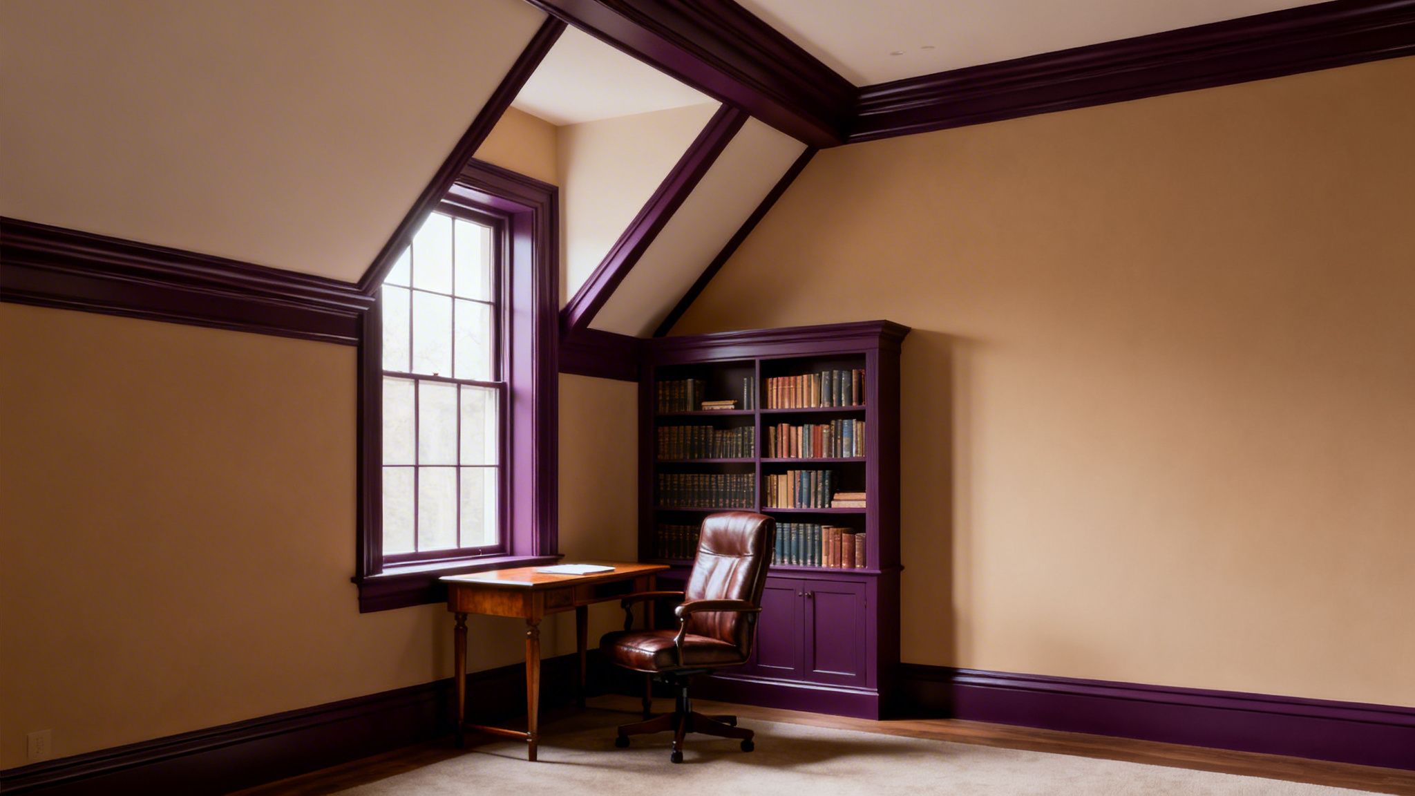
While classic whites and warm neutrals will always have their place, we’re seeing a real shift toward more adventurous trim colors. Choosing a dark, dramatic hue for your trim is a confident design move that adds instant depth, character, and a sense of luxury to any room. It’s a game-changer.
Think about a stately Fairfield County home with soaring ceilings. By painting the trim a rich charcoal or a deep forest green, you can ground the space and make it feel more intimate and intentional. Or imagine a cozy Westchester home office; dark trim can create that sophisticated, library-like atmosphere perfect for focus.
These bold choices aren't just about looks—they have a real psychological impact. Darker colors on trim and doors often make us feel secure, stable, and cocooned, turning an ordinary room into a refined sanctuary.
Embrace the Moody Hues
The trend is moving past basic black or navy and into deep, saturated jewel tones with a lot more personality.
Some of the most impactful options we’re seeing are:
- Deep Plums: A rich, moody plum adds a touch of warmth and historic drama.
- Rich Charcoals: This is a sophisticated alternative to pure black, feeling a bit softer and more modern.
- Forest Greens: Deep, earthy greens connect a room to the outdoors, creating a calm, organic vibe.
Deep jewel-toned trim is poised to be a major story in interior design. Trend specialists are forecasting a 42% rise in usage for rich plums like Graham & Brown’s Divine Damson as accent trims by 2026. It’s part of a “dark romantic” trend that offers timeless drama. For homeowners in the NY and CT area, these colors create stunning focal points that can add perceived value and a sense of refined calm. You can see more on 2026's top color predictions at elledecor.com.
The Key to Success is Precision
Bold trim colors are powerful, but they are also completely unforgiving. Unlike a flexible off-white, a dark shade will call out every single imperfection on the surface. Flawless execution isn’t just a goal; it’s an absolute requirement.
The success of a dark trim lies entirely in the prep work. Every tiny nail hole, dent, or uneven surface must be meticulously filled, sanded, and primed. A high-gloss or semi-gloss finish—ideal for durability—will only amplify mistakes, so the surface must be perfect before the first coat of paint is even opened.
This is where professional expertise becomes non-negotiable. Our teams are trained in the painstaking prep work that dark colors demand, which is the only way to get a smooth, durable, and truly impressive finish. To get an idea of the quality we deliver, feel free to explore our gallery of recently completed projects.
When done right, a dark trim doesn't make a space feel small; it defines it. This choice transforms simple woodwork from a functional afterthought into a deliberate and beautiful architectural statement. It shows you’re not afraid to depart from the expected, creating a home that feels uniquely personal and thoughtfully designed.
Testing Your Trim Color Selections Like a Pro
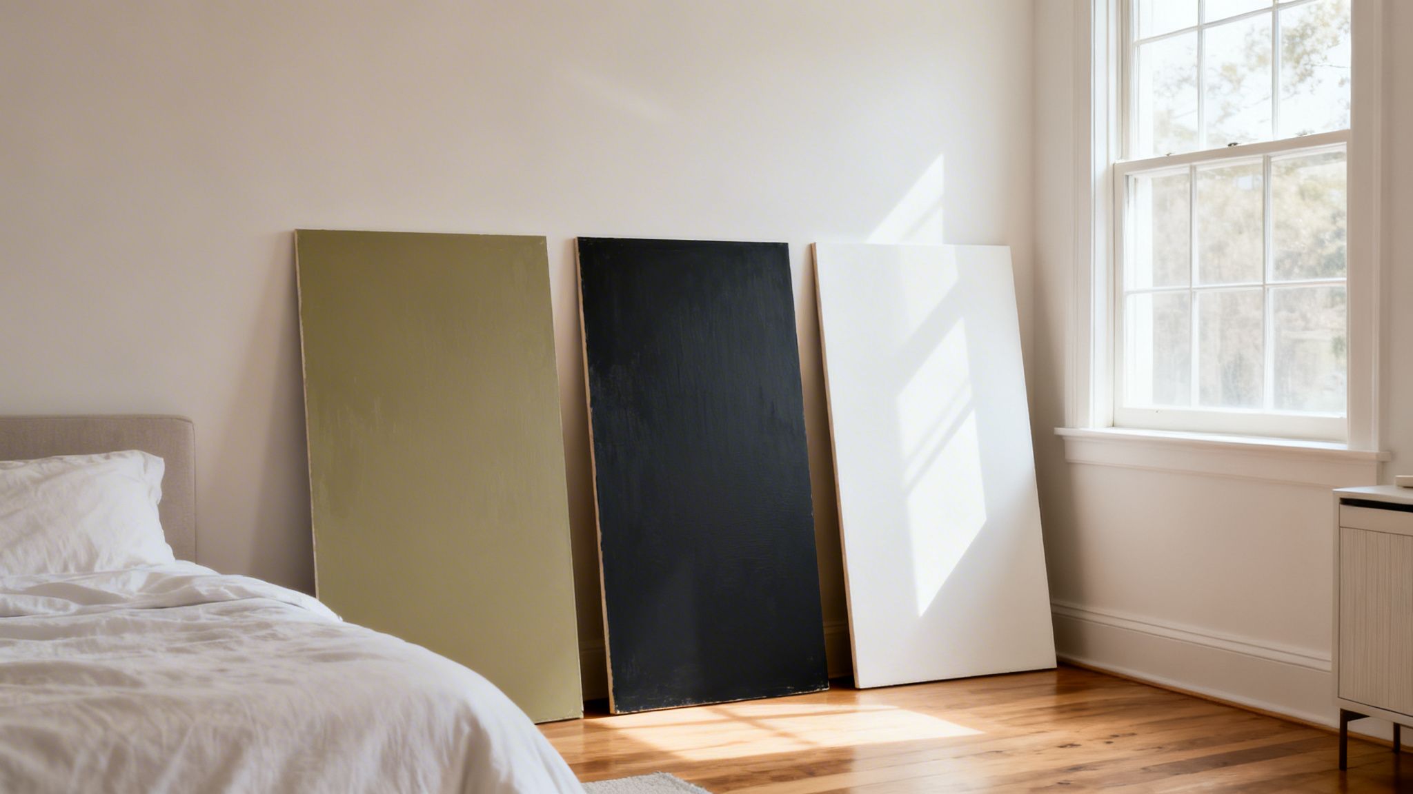
You’ve sorted through your options, but this next part is where you avoid costly mistakes. I can't stress this enough: never, ever commit to a trim color based on a tiny chip from the hardware store. Properly testing samples in your home is the one step that separates an amateur-looking job from a professional result you’ll be happy with for years.
The best way to test trim paint colors is to use large sample boards. We see homeowners make the mistake of painting splotches directly on their trim all the time. The problem is that the current color throws off your perception, and now you have a lumpy mess to sand down and prime later.
Instead, grab a few large pieces of white poster board or foam core. Apply at least two full coats of each potential trim color and let them dry completely.
See the Color in Its True Light
Now for the important part. Don’t just glance at the sample boards and call it a day. The whole point is to watch how the color shifts and changes as the light moves through your room.
Take your sample boards and move them all around the space. Hold them up next to the window, place them in a dark corner, and see how they look against different walls. This is especially important in places like Connecticut, where the natural light changes so dramatically between a bright summer morning and a gray winter afternoon.
Make sure you look at your samples at these different times:
- Morning Light: Tends to be bright with a cool, blueish tint.
- Mid-day Sun: This is your most neutral and true light.
- Late Afternoon: The light gets warmer, bringing out golden or orange tones.
- Artificial Light: Flip on your lamps and overhead lights at night! A color can look completely different under indoor lighting.
Going through this process means you won't get any unwelcome surprises after the paint is on the trim. That perfect greige you loved in the morning might suddenly look muddy and unwelcoming under your lamps at night.
A critical part of testing is context. Place your painted sample board directly next to your walls, flooring, large furniture pieces, and even kitchen countertops. The color doesn't exist in a vacuum; its true character is revealed by how it interacts with the elements already in your home.
This simple, hands-on step ensures the color you chose in the store is the one you’ll actually love on your trim. It’s also the perfect way to see if a modern, trendy color will feel right in your home’s unique setting.
For example, designers are starting to use more complex, nature-inspired colors for trim. Behr’s 2026 Color of the Year, Hidden Gem, is a smoky jade that’s predicted to see a 38% growth in trim applications. According to Erika Woelfel, their VP of Color, it has an "eternal stun" factor, but a color this complex absolutely must be tested in your light. You can learn more about how nature-evoking tones are influencing the 2026 color forecast on paint.org.
Common Questions About Trim Paint Colors
Even with a few color chips in hand, some final questions always seem to pop up right before you commit. We get them all the time from our clients across Connecticut and New York.
Here are the answers our CP Painting team gives every day to help homeowners finalize their trim color decisions with confidence.
Should All Trim in My House Be the Same Color?
Absolutely not. While sticking with one consistent trim color is a classic, safe bet for creating cohesion, it’s far from your only option. In fact, using different trim paint colors can be a fantastic way to define separate spaces and craft a unique mood for each one.
For instance, you might use a bright, crisp white in your main living areas to keep things feeling open and airy. But then, for a dining room, office, or library, you could pivot to a dramatic navy or a deep, moody charcoal on the trim. That simple shift instantly adds a layer of intimacy and sophistication, turning that room into a special destination.
The key is making the shift feel intentional, not accidental. Our rule of thumb is to keep the trim color consistent across a single floor or within a connected, open-concept area. This prevents the flow from feeling choppy. Our team can help you map out a color journey that moves beautifully from one room to the next.
What Is the Best Paint Sheen for Trim in High-Traffic Areas?
For busy areas like hallways, kitchens, mudrooms, and entryways, durability is king. We almost always recommend a Semi-Gloss finish for trim in these high-traffic zones. Its smooth, subtly reflective surface is incredibly tough and built to handle the scuffs, dings, and fingerprints that are just part of everyday life.
Just as important, it’s a breeze to clean. You can easily wipe away grime and smudges without worrying about dulling the finish. A Satin finish is a good alternative with a bit less shine and solid durability, but for baseboards and door frames that see daily action—especially in a bustling Fairfield or Westchester County household—Semi-Gloss simply offers the best long-term performance.
Can I Paint My Vinyl or Composite Trim?
Yes, you can definitely paint vinyl and composite trim, but this is one job where process and products are everything. You can't just grab a can of standard interior paint and expect it to hold up.
Painting these synthetic surfaces correctly involves a few non-negotiable steps:
- A Deep Clean: The surface has to be perfectly free of all dirt, oils, and any chalky residue that builds up over time.
- A Specialty Primer: You must use an adhesion-promoting primer made specifically for plastics and vinyl. If you skip this, the paint has nothing to grab onto and will inevitably start to chip and peel away.
- The Right Top Coat: Once primed, a high-quality, 100% acrylic latex paint will give you a durable, beautiful finish that lasts.
Because this process is so technical, we usually tell homeowners it's a job best left to the pros. We have the right products on our trucks and the expertise to ensure a smooth, factory-like finish that will look great for years.
Ready to transform your home with the perfect trim color? The experts at CP Painting Company are here to help. From precise prep work to flawless application, we ensure every detail is perfect. Contact us for a free estimate and let's bring your vision to life. Learn more at cppaintintct.com.


